Show Me the Way to Go
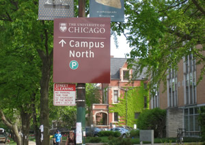
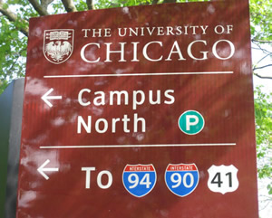
 It was an enormous undertaking.” That’s how Richard Bumstead, associate director of Campus Environment at the University of Chicago, describes the process of developing that campus’ continuing signage program.
The experience there speaks to broader trends in what institutions around the nation are facing and seeking in new signage today.
The distinguished University of Chicago campus is surrounded by a busy, loud urban environment with plenty of vehicular and foot traffic. In such environs, providing effective wayfinding cannot be easy:
The Chicago streetscape teems with city signs and, being deep within the city, is far from highways. Thus, “it was tough for people to navigate” to campus, says Bumstead. Throw in the need to work well with a wide range of distinguished architecture, and you had better roll up your sleeves.
The impetus: layers of signage that had become outmoded. In Bumstead’s view, “signage programs typically have 10 to 15 years of life, and here, disunified systems installed in the 1990s and then again about 2000, had become obsolete.”
So, campus stakeholders, working with consultant Cloud Gehshan Associates, hammered out and are implementing a plan that, among other things, integrates new signage with original architectural signage, uses colors that balance conspicuity and aesthetics, meets city requirements, takes landscaping needs into account and smoothly accommodates some pre-existing signs, such as kiosks with lighting, which will remain.
To get there, Bumstead says, the university organized a steering committee consisting of vice presidents and chaired by the university’s associate vice president for communications; and a broad-based campus working committee to share insights, make signage decisions and implement them. Campus officials also worked with the city and Chicago’s Park District.
Work started, with planning kicking off about three years ago, on an outside-in, multi-phase program. The first phase, completed this spring, deployed directional signage for vehicular traffic. The next phase is to guide pedestrians to major campus destinations via various markers and changeable, extruded maps; then, individual building signage as well as gateway markers; and finally, regulatory signs. Poblocki Sign Company is the manufacturer for the Chicago project.
Among the related features also being implemented on that campus: Americans with Disability Act signage, and large markers in glass, steel and stone.

WHO GOES THERE? An important factor to consider in campus signage programming is who your sign will be messaging: pedestrians, motor vehicles or both. If motor vehicles, the speed of traffic impacts the sign’s size. Local sign permitting restrictions also affect sign size. Finally, sign materials such as rustproof aluminum and vandal-resistant covers should be taken into consideration.
Consultant Virginia Gehshan explains that the steps at Chicago included mockups and prototypes, which “are an essential part of the design process. They allow both campus representatives and designers to ‘kick the tires’ and see the signs in situ. Inexpensive, full-size paper printouts allow testing of legibility, sign sizes and placement. Later in the design process prototypes in the actual materials can be installed and viewed for days or weeks; they allow for further design refinements and committee ‘buy-in.’”
Costs for programs at large campuses typically can run into the six figures, says Gehshan, who notes several trends, including interest in signage that is essentially “a thread that runs through everything,” including diverse architecture and spaces; programs that emphasize landscaping, including tree and plant identification; storytelling signage to tells the history of a campus; and programs that recognize donors. Also, campuses have been integrating signage and apps. According to Gehshan, there’s a caveat to keep in mind: “Many campuses are interested in smartphone apps as an attraction for prospective students. A less expensive first step would be developing a mobile version of the campus website that focuses on wayfinding and storytelling.”
Among the other trends, not too surprisingly, is an abiding concern about programs that give a good return on investment, says Jeff Stewart of Howard Industries. He notes a continuing move by campuses toward light-emitting diode (LED)-illuminated signage, digital signage for interiors, plenty of pole banners, and modular systems for exteriors and interiors.
 One of the things to keep in mind, says Barbara Martin of KMA Design, is the need for signage maps that are very clear. She believes that the best maps show an oblique aerial view that is realistic and emphasizes a campus’ iconic landmarks and structures.
In another tack, permitting can be a high hurdle for some campuses, explains Danny Roberts of APCO Signs. In some instances, institutions envision ambitious signage programs that extend off campuses before reaching a point in the process where they encounter difficult city or county permitting issues and find they need to change course.
Indeed, working with neighbors such as cities and counties can be key step in the signage process. Mark VanderKlipp of Corbin Design explains that his firm, to take one example, worked with the University of Michigan, along with its surrounding city of Ann Arbor, on a program that included campus signage on local streets there. These signs were part of a progressive disclosure approach where signage guides visitors inward while denoting a city, its downtown and districts, then various destinations on the campus.
Back at the Chicago campus, the comprehensive signage process has been worth it, officials believe. There’s a lot at stake, and as Bumstead adds, “A well-thought-out system is a life-saver for a campus.”
Some Rules of Thumb for Today's Campus Signage Systems
Remember that “a homemade sign looks like a homemade sign,” says Richard Bumstead at the University of Chicago. “You want it to look professional, so spend the time to go through it, to have a lot of review.”
Ask for mockups and prototypes during the design phase, suggests Virginia Gehshan of Cloud Gehshan Associates.
Keep it simple, says Barbara Martin of KMA Design, and that includes the design, content and messaging of each component. Strive for a balance.
Focus on visitors. In other words, “turn your vision inside out,” advises Corbin Design’s Mark VanderKlipp, who adds, “consider the needs and expectations of visitors and meet those simply.”
Set up a cross-disciplinary signage group, recommends VanderKlipp. Reach out to facilities, alumni, marketing and others for varied insights.
Get involved with suppliers as early in the process as possible, APCO’s Danny Roberts suggests. Doing so can preclude problems down the line, such as permitting. Get a general idea, then reach out — better to build your signage idea from the ground up then to overreach and scale down.
Consider a sign family concept. In other words, try a unified, logical approach for your directional, identity, pole banner, exterior and interior signage, says Howard Industries’ Jeff Stewart. Along that line, carry your exterior look to the interior, and vice versa.
Work with experts that provide signage master planning services that include design, costs, budget phasing and manufacturing and fabricating expertise, suggests Stewart.
Think modular from the beginning. Interchangeable, extruded systems make sense because “change is ever present,” Stewart says.
Remember that signage can be the first thing visitors notice, Martin adds, and “if it doesn’t work well, it creates frustration and sends the wrong message.”
About the Author
Scott Berman is a freelance writer with experience in educational topics.