Modernization
Palo Alto High School's Library Transformation
- By Yvonne Marquez
- October 18th, 2019
Palo Alto High School’s former library was described as “disjointed, dark and inefficient” by the school’s librarian. The library was located in a windowless space surrounded by private offices in a building built nearly 50 years ago. It was time for a change.
“The design team from HED considered the 1970s existing building and saw the opportunity for a dramatic transformation,” HED architect, Erwin Lee said.
The library’s transformation was the last major facility on campus to be funded through the $378 million Strong Schools Bond passed by voters in 2008.

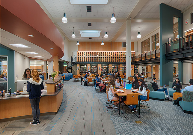
Teacher/librarian Rachel Kellerman and Palo Alto High School staff envisioned a space that would feature updated technology, natural light, and a more functional, open layout with clear sightlines and improved circulation patterns. Lee and Kellerman collaborated together to create a completely modernized library.
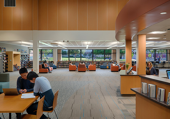
“The architectural vision was to push the library to the corner of the building to gain access to natural light and views to the campus quadrangle,” Lee explained. “The relocation resulted in spaces of multiple heights that were more appropriate to the different library functions.”

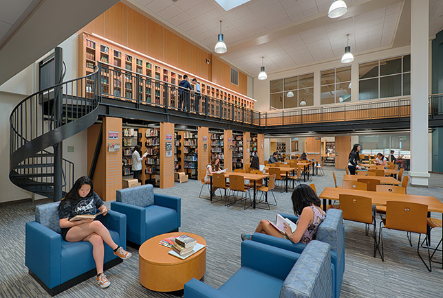
By moving the library to a corner of the building, it now has ample daylight coming from windows which has dramatically changed the space. The design team added a new mezzanine level with a spiral staircase which doubles as a gallery space to display the school’s 125-year-old journalism archives and rare books collections.
“It’s a very appealing setting, and one that the kids have responded to positively,” teacher/librarian Sima Thomas said. “That aspect, plus the spatial qualities of the space, including the staircase and the mezzanine. Many kids told us that this feels like a ‘real’ library.”

Students used to cut through the library to get to the other side of the building. The design team created a pathway through the building to encourage flow and in doing so gave the library a proper entryway. The 25,600-square-foot building now houses the library with flexible instructional space, an adjacent gallery, college and career counseling and guidance services.
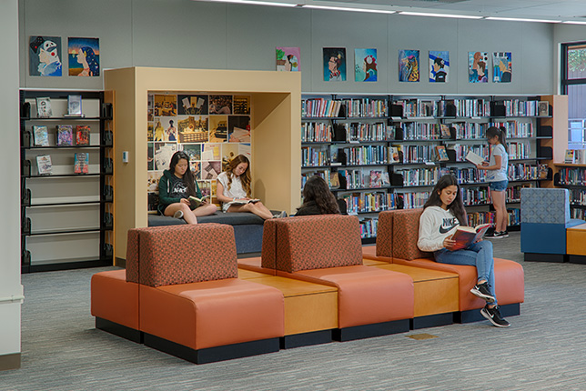
Students are able to enjoy silent and group study rooms, reading nooks and a large reading area with natural light and comfortable seating. Fiction and nonfiction books are able to be displayed in a more pleasing and accessible way which has led to higher circulation rates.

“This project shows how much is possible through thoughtful, carefully design renovation,” Kellerman said. “The existing building was uninteresting — the design team transformed it completely. We have transecting walls, interesting volumes, and a dedicated entry that honors the library as the hub that it is. Tearing down is wasteful.”
About the Author
Yvonne Marquez is senior editor of Spaces4Learning. She can be reached at [email protected].