The Finished Product
An expanded palette of materials choices is adding to architects' ability to add vivid color to both the exterior and interior of campus buildings.
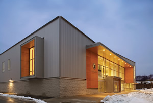
PHOTO © ROBERT BENSON PHOTOGRAPHY, COURTESY OF SASAKI ASSOCIATES
Certain traditions rule campus architecture. Brick and stone. Ivy. Aesthetic coherence, whether the predominant style is Georgian, Collegiate Gothic or Spanish Renaissance.
Architects always had the opportunity to stretch the boundaries of convention by selectively integrating the contemporary and the traditional. But stretching those boundaries, and even smashing them, is a lot simpler now, as various materials and cladding systems that are more common to commercial architecture have begun to make inroads into the more staid world of colleges and universities. Advances in metal, phenolic, composite and glass laminates offer designers a greater ability to spice up building exteriors and interiors with color and texture, and subtly alter perceptions of building size and scale.
Color My World
For all the significant advantages of exterior metal and phenolic panels — impact- and weather-resistance, lower cost, energy efficiency — it’s the aesthetic possibilities that have the greatest impact on the look and feel of the campus.
Used sparingly, these products can provide a stark counterpoint to more commonplace materials. For example, the low-cost corrugated building skin of Trinity College’s Koeppel Community Sports Center in Hartford, CT (above), befits its primary use as an ice rink. Adding warmth and ease of wayfinding was a simple matter of specifying woodveneered phenolic panels around punched window openings and, most dramatically, around the building entry. Similarly, at Towson University’s 5,200-seat SECU Arena in Maryland, orange-hued wood veneer phenolic panels surround a one-story entry, the large window portal of the suitelevel hospitality room and the main arena entry, which is set back 100 feet from the arena’s east wall. The spot color at the entries aids in wayfinding, but there is another purpose in this case — to trick the eye, making the facility seem longer and more horizontal than its actual footprint would suggest.
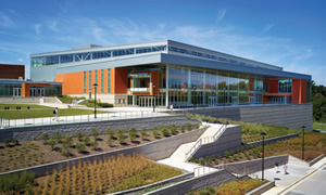
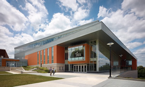
PHOTOS © PATRICK ROSS PHOTOGRAPHY, COURTESY OF SASAKI ASSOCIATES
WALK THIS WAY. Exterior features of a facility (in addition to signage) can aid in wayfinding. At Towson University’s SECU Arena, orange-hued, wood veneer phenolic panels, a generous eave and copious glass combine with spot color at the entries to help direct visitors.
Cladding an entire building in colorful panels might not be every client’s choice for a building exterior, but as Stony Brook University’s Campus Recreation Center in Stony Brook, NY, demonstrates, a vivid color scheme can really set a building apart. Stony Brook’s year-old center undeniably enlivens the campus and sets the tone for the activity — the play — found within.
The rec center’s exterior skin consists of insulated metal panels that clip into a track and into each other, with installers anchoring them starting at the bottom of the exterior walls and working upward, where the topmost panels are locked into place with a termination strip that is hidden by the roof coping. Although there’s a random-seeming quality to the different colored panels, the arrangement was painstakingly designed and modeled, and all panels were numbered to ensure their proper placement.
Metal cladding systems’ engineering allows for a certain amount of interchangeability even late in the design process; modeling the systems can offer building owners the option of trying out dozens of color and texture combinations before making the final decision. The Stony Brook center, for example, was originally conceived as a blue, blue-green and gray building that evoked Long Island’s glacial past. When campus administrators eventually decided that the building should instead hew to at least one tradition and utilize the school’s color of red, a new palette was selected and the change was made after a number of different color choices were modeled for the client.
Go With the Flow
Because architects and interior designers look for opportunities to aesthetically knit different spaces together, exterior materials — or building materials of like color or texture — sometimes make their way into the building interior. Interior designers hope to achieve what they refer to as “color flow” by carrying the palette through each floor of the facility in certain small ways. Typically, the color scheme, often a school color in athletic facilities, will be presented in a small but consistent number of locations: walls, wall pads, weight room flooring, signage, banners and so on.
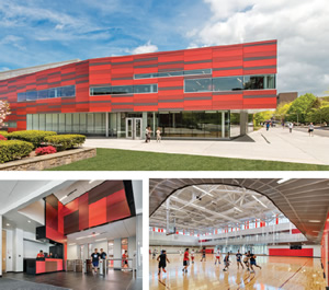
PHOTOS © ANTON GRASSL/ESTO, COURTESY OF SASAKI ASSOCIATES
THE ‘WOW FACTOR.’ The exterior design features school colors and utilizes multi-hued red metal panels and glazed concrete block for the recently completed recreation center on Stony Brook University’s campus. The building is forward looking, identifiable, invitin
Metal and phenolic panels are particularly suited to this indoor/outdoor use. At Stony Brook, phenolic panels were used (as with the exterior) in a random-seeming pattern in several locations inside the center to help unify the building’s aesthetic. The face of the main check-in desk, the wall above the entry, the face of the fitness center’s help desk and banks of day lockers outside the three-court gymnasium all feature horizontally and vertically stacked panels in a range of reds, grays and gray-black to black, a color scheme that evokes the exterior but with a warmer, richer tone. To ensure the eye reads all these surfaces as working in concert, the joints between all the different floor, wall and ceiling materials line up perfectly from the exterior to the interior, from one floor to the next and from one interior surface to another. (The rigor of the Stony Brook facility’s design is what allows the “randomness” to still look “right.”)
SECU Arena brings its warm-toned exterior phenolic panels and terracotta into the arena bowl by cladding the length of the suite level in a wood-veneered phenolic panel system. From the outside, through the storefront glass that separates the arena from the long promenade by which spectators approach the building’s entry, the wood tones seem to extend inward from the panels used at the entry and hospitality room’s window portal. Once inside, visitors enter onto the 32-foot-wide north concourse with the suite level just above, with its warm, wood-toned ceiling creating a unique concourse experience. (Its high level of finish, when compared to typical arena interiors, has led the university to view the open concourse as an inviting place to hold special functions and hospitalities during the roughly 310 days a year when no sporting events are scheduled.)
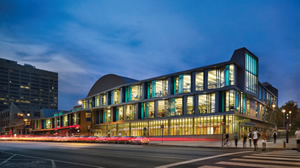
PHOTO © BARRY HALKIN PHOTOGRAPHY, COURTESY OF SASAKI ASSOCIATES
I CAN SEE THROUGH WALLS. The large number of windows included into the design of the exterior of the Drexel University Recreation Center takes advantage of advances in glass, and engage the street by offering transparency that provides views of the activity within. The insertion of flexible polyvinyl into double-paned windows allows for the addition of color and pattern to glass units. The design also utilizes clear and colored laminated glazing, augmented by metal and phenolic panels.
Advances in glass — the insertion of flexible polyvinyl into double-paned windows for reasons of safety and solar control, allowing for the addition of color and patterns to glass units — have made this material a key part of unifying buildings’ interiors with their exteriors. The design of Drexel University’s Recreation Center utilized clear and colored laminated glazing, augmented by metal and phenolic panels, on its south, west and east facades, animating the Philadelphia streetscape. The blue and gold glass evoked Drexel’s insignia colors, a motif that was repeated inside and, most memorably, on a north-facing outdoor activities plaza featuring a blue and gold permeable rubberized surface.
The Stony Brook center’s use of glass is less “showy,” perhaps, but no less dynamic. Horizontal ribbon windows appear on three elevations; on two of them, windows of different widths and lengths are placed (again) seemingly randomly within the metal panel grid. In the north and east concrete-block walls of the gymnasium and MAC, vertical windows are inset in an asymmetrical fashion, which is mirrored by use within a clerestory above of sporadically clear- and red-paned vertical windows. It is in the colored glass that one begins to understand the way in which “randomness” heightens the sense of movement and energy by interrupting the eye’s expectation of symmetry.
Bucking Tradition
While the pull of tradition is strong, more college planners are remaining open to the aesthetic possibilities offered by these state-of-the-art building materials. Borrowed from corporate and retail architecture, these cladding systems can really help designers elevate institutional buildings from the ordinary.
This article originally appeared in the issue of .