Your Furniture, Your Brand

PHOTO COURTESY OF CSO ARCHITECTS
A lot of institutions see branding as their logo and tag line,” says Jim Paskill, president of Glenside, PA-based Paskill Stapleton & Lord, which assists higher education clients with brand identity, consulting and more. “I think they’re missing the big picture. It’s how you see yourself in the marketplace and across a number of constituencies, including business and industry leaders, prospective students, alumni and sports fans. So there are different brand segments for different constituencies.
“Every school has a brand,” Paskill continues, “but they may not agree with it — they may be known for things for which they don’t want to be known.” His firm works with college and university administrators to shape their brands via visual and messaging consistency so that they become known for what they want to be known. It’s a process, not an overnight change, he cautions. As with many things, when it comes to branding, the devil is in the details.
One of those details, believe it or not, is your furniture. You use it every day, walk past it all the time, and eventually stop seeing it. It becomes dated and worn and, as a result, negatively affects your brand.
“I think there’s a literal tie between brand and furniture,” says Paskill. “It’s a reflection upon the facilities, which tie into the brand in terms of ‘are you state-of-the-art, moving forward, providing a quality educational experience?’”

PHOTO COURTESY OF CSO ARCHITECTS
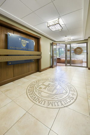
Julie C. Boynton, LEED-AP, director of Interior Architecture at University of Notre Dame (ND) in Indiana, agrees with Paskill. She indicates that “every project from our office (which is the office of Planning, Design and Construction in the division of Facilities Design and Operations), whether new construction or renovation, whether small or large, includes a line item review for theming and branding. Nearly every project states our brand, whether literally or subtly. How a project states our brand depends on what the client is trying to promote. We always look at it as an opportunity, and we will continue to consider many formats and ways to incorporate a campus client’s desire for branding.”
Here’s a closer look at furniture as a branding tool, in terms of indoor and outdoor furniture and fixtures.
INDOOR
Branding via indoor furniture has a number of different angles.
First, it can be as simple as color. Take dining facilities, for example, which state your brand in a positive manner when they look like the latest and greatest dining venues you see in the commercial world, indicates Beth Keyes, LEED-AP, vice president for Facilities and Campus Operations at Ohio’s University of Dayton (UD). That look is easily combined with your school colors to boost your brand statement. And that works for UD, as Keyes notes: “About the only time we do a lot with the brand on campus is with the color. We’re red and blue. If we have color, it’s red and blue. Otherwise, it’s neutral. There won’t be green and gold.”
Second, your brand can be as brilliantly stated as splashing your logo in furniture — engraved on chairs and tables in the president’s office conference room or the boardroom — to set a tone of formality and academia. It can be emblazoned on the backs of chairs in athletic facilities to set a tone of spirit and support. And, at ND, the logo has been engraved on or added as a decorative element to the front of reception desks, as well as added in wood, metal and glass as three-dimensional back walls behind reception desks.
Third, it can be subtle. “We work hard to not just do literal branding on our furniture and fixtures,” says Boynton, “but to also do things subtly. For example, we have a new molecular biology research facility coming online next summer, and we’re using a pattern in the fabrics and wall coverings that emulates that department’s brand — stating their mission and goals.”
OUTDOOR
Your outdoor furniture also contributes to your brand, although it may not seem to be the case simply because there is so much less of it than there is indoor furniture. Take a look at what administrators at University of North Carolina Asheville (UNCA) have done. In the spring of 2014, they began planning to install the first-ever hammock pods on a college campus. One of the goals of using hammock pods was to alleviate stress on trees caused by students hanging hammocks where they could find the appropriate amount of space between trees to support them, thereby sustaining natural resources.
Two pods were installed by the beginning of the fall 2014 semester. They are located in two convenient spaces for all students to use and receive WiFi: in the A.C. Reynolds Green and behind Mills Hall next to a volleyball court. Students can use their own hammocks, rent them for a small fee from Campus Rec or borrow them free for 24 hours from the housing office.
The supplier donated the pods and six hammocks, painting the pods in UNCA’s royal blue and white colors and customizing the plating with UNCA’s logo. How do the hammocks contribute to the UNCA brand? They clearly say that UNCA values sustainable resources, and is creative and student-centered.
FIXTURES

PHOTO COURTESY OF UNIVERSITY OF DAYTON
Believe it or not, fixtures such as trashcans, recycling bins, banners/signage and wall coverings also contribute to your brand statement. Here’s how.
The first consideration is, simply, cleanliness and orderliness. Are your trashcans and recycling bins clean, or are they streaked with dirt and spills? Is your signage hung straight? Is it in good repair? Are your wall coverings clean and in good repair, or do they show dirt smudges and are they peeling? As already noted, it’s the details that make a world of difference in how your brand is viewed.
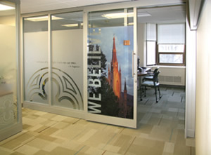
The second consideration is branding with your logo or mascot. “At nearly all of our athletics facilities,” says Boynton, “we’ve tried to use our branding to highlight what’s recycling and what’s trash. For example, to create a consistent subtle cue to patrons, we’ve used our green shamrock on recycling bins and our leprechaun or interlocking ND on landfill receptacles from facility to facility. Also we have done a lot of theming in not only our athletics facilities, but many projects across campus applying approved Notre Dame symbols, including the shamrock, leprechaun, capital ND and university seal, to banners, signage, wall coverings and light fixtures. We wouldn’t plaster a suite with every symbol, but choose to use them in appropriate and classic ways.”

PHOTO COURTESY OF UNIVERSITY OF DAYTON
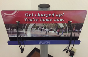
Keyes admits that funding has been tight for putting the UD logo on wastebaskets and recycling bins: “It definitely could be better done.” On the up side, she notes that they have used UD’s logo as a large printed graphic on walls, making a sizeable visual statement. “For instance, at the Marriott that we own, a whole wall of a room might be a black-and-white graphic picture.”
Here again, for both ND and UD, attention to design detail impresses their brands upon guests in a positive way. And guests take that impression with them into the local community and beyond.
Your furniture take-home: For a positive brand identity, pay attention to the details. Keep it clean, keep it fresh, ensure there’s no fading or tearing, tighten bolts and cover scratches. As Boynton sums: “People know they’re on campus, so we’re not trying to highlight the location so much as emulate the brand — provide it in a way that people always feel the essence of Notre Dame regardless of what building or department they’re in. It’s the sense of tying it all together.”
This article originally appeared in the issue of .