Everywhere a Sign
PHOTOS BY SCOTT BERMAN
Signs can point the way to go, but also the ways that schools and society are going. That is, signage speaks to the continuing process of fuller inclusion, as well as a widening range of functions, technologies and materials, and today’s heightening educational and aesthetic expectations. Environmental expectations, too.
Visitors are guided to and through a school building and campus with interior and exterior directional and wayfinding signs, freestanding or mounted on building facades, dimensional letters, ADA-complaint signs, parking signs, Braille features and raised letters room signs, menu boards, display cases and other items, some using energy-saving LED lights and constructed from environmentally friendly materials. These signs meet many needs while adding to the aesthetics of a site.
Green signs. Green-themed signs are designed to teach important lessons that help the students understand environmental issues and visualize the connection between stewardship and the environment so they will develop good habits as they go forth in life.
There are also green-themed signs designed to teach important lessons throughout a school. In fact, green informational signage is an important part of the process of “really helping our students to understand the environment that we are asking them to try to conserve and protect,” says Principal Stacey Mamon of a comprehensive green signage program at her school, Manassas Park Elementary in Virginia.
The school, opened in 2009, was a green systems and signage forerunner with plenty of current lessons to share, as revealed during a walk through with Mamon and District Superintendent Bruce McDade.
The school’s architect, Wyck Knox of VMDO Architects, says the sign program is designed to “visualize the connection between stewardship and the environment” and to not just to give information but help “instill good habits” in youngsters as they go forth in life. In other words, signs with information and messages intended to teach about green while prompting behavior. If that happens, “then you’ve got something really important,” adds Knox.
PHOTOS BY SCOTT BERMAN
Among the details:
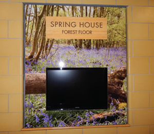
- Signs keyed to wings of the building that each represent a season, with each amplifying a seasonal color scheme. Rooms are named and labeled for local and regional flora and fauna; and in at least one instance, named for trees just outside and visible from the location of the sign.
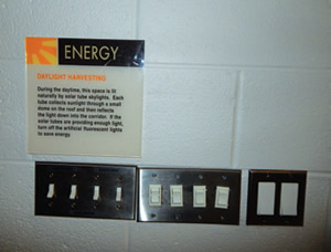
- Brief but detailed signs explaining how a feature is environmentally friendly. A “Rainwater Reuse” sign, for example, explains how harvesting rainwater saves “an estimated 1.3 million gallons a year.” Other signs focus on “ground heat exchange”, “natural ventilation”, and in another telling example, “daylight harvesting” beside light switches in a gymnasium equipped with solar tube skylights.
- A sign keyed to winter that throws in a physical fitness theme, by describing the invention of the game of basketball.
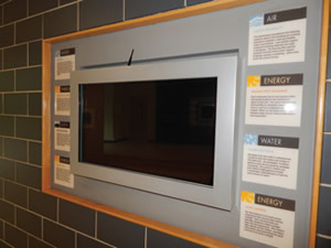
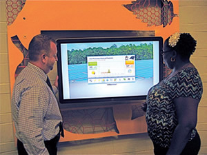
- A large flat screen monitor serving as a real-time energy usage dashboard outside the school’s administration offices.
PHOTOS BY SCOTT BERMAN
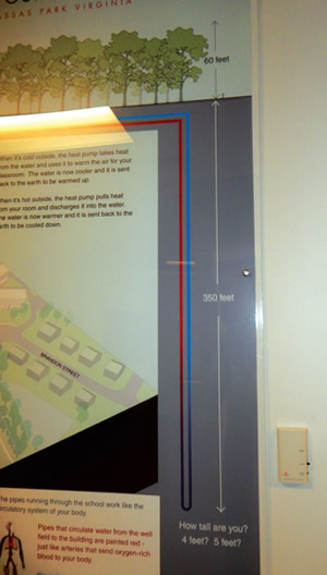
Additionally, in a different kind of display, some mechanical components are made visible, with condenser water supply and return pipes shown through glass beside a large sign describing and depicting the building’s ground source energy system. That sign relates information to youngsters, in part by giving the great depth of those pipes underground and placing it in scale in part by asking, “How tall are you? 4 feet? 5 feet?”
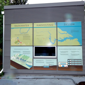
Even a cistern building a few yards from the school is utilized as a learning opportunity, with large signage panels describing the school’s rainwater harvesting system, and placing it all in context to local geography. The cistern’s mechanical system is visible through glass as well, with the entire arrangement a focal point for what is essentially an outdoor classroom.
PHOTOS BY SCOTT BERMAN
Information Please. Some of the signs in the school are keyed to wings of the building that are name for seasons of the year, and have a seasonal color scheme. Others explain how a feature is environmentally friendly. Examples are rainwater reuse, ground heat exchange, natural ventilation daylight harvesting. There is also a flat screen monitor serving as a real-time energy usage dashboard outside the administration offices.
Interesting examples of green informational signage and digital information appear in various forms elsewhere. For instance, there are basic signs packed with information and keyed to a smart phone app at Wisconsin’s LEED Platinum Lake Mills Middle School, where additional signs appear on energy-efficient mechanical components.
There are displays on a large attractive dashboard monitor mounted in the central hall of Sandy Grove Middle School, which is housed in a new net-positive building in North Carolina; and another interactive dashboard — to take another of many dashboard examples — enables youngsters to keep tabs on energy use at Pennsylvania’s Charles Patton Middle School, one of the many features that helped the school earn a U.S. Department of Education Green Ribbon award in 2015.
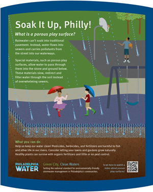
Consultant Virginia Gehshan, principal of Cloud Gehshan Associates, describes a green signage program in Philadelphia that placed and labeledwith informational signage rain gardens and tree trenches in schoolyards and parks. The signage is written on a 4th or 5th grade reading level and is manufactured by Urban Sign from robust materials that withstand weather, are cleanable, vandalresistant, containing no sharp edges and placed in planting beds, away from the path of foot traffic.
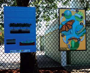
A simple but attractive set of informative signs about storm water capture and the environment turn a high chain-link fence into a colorful learning moment at Twin Parks, a public school campus in New York City.
Finally, it’s all about greener approaches physically and educationally: an approach that can make lasting, tangible impressions on youngsters who will potentially carry environmental awareness and practices into their lives and future careers. Informative signage can be part of that program.
As Manassas Park’s Mamon adds, “Learning just doesn’t happen inside the classroom, sitting at your desk. It happens in so many places, inside and outside of the building.”
PHOTOS BY SCOTT BERMAN
Some ideas about making a difference with environmentally themed and other signage today:
- Consider using signs that take changeable inserts to keep costs down and make their messaging flexible over time, Gehshan suggests.
- Remember that signage is part of the broad process to design school environments that support curriculum. As Mamon explains, it’s about curriculum first, design second. Getting both right takes collaboration.
- Relate detailed signage information to youngsters. Ask how you can relate complex information to a boy or girl reading the sign.
- Survey your building and campus: there are potential learning spaces, even in seemingly mundane or unlikely spots, which signage can help create.
- Bear in mind that with green signage, one size doesn’t fit all. In other words, theme a signage program not just to the environment, but also specifically to your locale, as architect Knox suggests.
- Strive for information fostering stewardship, Knox says. Use interactive features or practices to get kids involved.
This article originally appeared in the issue of .