Appearance Does Matter

PHOTO © JUD HAGGARD
A special outside can communicate the pursuit of excellence on the inside. At least that’s the case
for various K-12 schools with highly distinctive and functional
exteriors. Three recent school projects in disparate locales
illustrate the point.
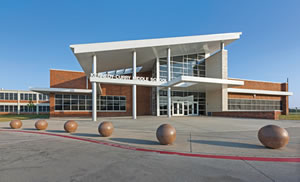
Take for example the concrete sphere bollards in front of Kennedy-Curry Middle School in Dallas, Texas. They are a functional,
creative way to boost curb appeal, define the building’s front plaza,
and to help provide safety and security.
That’s how Richard Chi of PBK Architects, which designed
the new Kennedy-Curry, describes the bollards, just a small but
distinctive feature of a major renovation and expansion, which
doubled the pre-existing building’s size.
According to Chi, his design team had a productive design
charrette with district officials who pointed out material preferences
as well as a broader notion that the new building needed
to have a distinctive presence and be a source of pride for the
community. The exterior had to help achieve that goal while also
referencing local construction in an affordable manner — the
locally produced, commonly used brick of the pre-existing façade,
masonry and some metal panels all pointed the way.
Ideas, materials and forms converge at the main entry of Kennedy-Curry: a high metal colonnade, a brick façade, a zigzagging
metal overhang as well as a glass-and-steel entry atrium, a main
door beneath a canopy, and above it all: a great, sloping metal roof.
The end result: a project that brings the facility forward, “celebrates
the school and fits the context,” Chi adds.
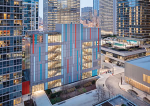
In a very different setting, the exterior of GEMS World Academy
Lower School, a high-rise structure in Chicago, presents very different
solutions. The design, by bKL Architecture, “with its playful
façade…provides an aesthetic contrast with the context of an otherwise
neutral neighborhood of high-rise residential and commercial
buildings,” says bKL’s Lynne Sorkin. That façade features “interlacing
colored metal panel and varied types of glass,” combining these
and other elements to create “a strong presence,” she explains.
Sorkin says, “With a combination of high-performing Low-E glass and insulated metal panels
we were able to achieve a cohesive exterior
design, address a range of interior functions,
provide an abundance of natural light
and limit thermal heat gain.” The architectural
firm worked with WMA Consulting
Engineers to integrate components such as
insulated glazing units and the aforementioned
metal panels, high-performance
lighting systems, energy-efficient walls
and roofs, among others, to come up with a
building that is visually compelling as well
as pragmatic.

PHOTO © EWING SOM
Take the exterior glass for example, for
which the designers designed a frit pattern
that enables several things simultaneously
of relevance to a key space behind the glass.
As Sorkin continues, “two of GEMS’ façades
incorporate high-impact glass with a
silk-screened pattern that covers 60 percent
of the surface at a 6th level Multipurpose
Room. Use of the frit cuts down on glare,
without the use of shades, and enables the
space to be used for athletic functions,
with only a subtle change in appearance
to the exterior.” Viewed from the outside,
the room is a corner glass box atop metal
paneled sections — the façade’s continuity
is emphasized with a vertical red panel
that continues from the floor below. The
set piece also relates to stairwells behind
exterior glass. And there, too, the exterior
is articulated thematically and very
practically. Sorkin describes the approach:
“integration of glass at stairwells provides
students and staff with a frame of reference
to the exterior and improves way finding as
students move from floor to floor. Through
a sun study, our team confirmed that the
positioning of the stairs at the north elevation
combined with the shading effects of
surrounding buildings would limit solar
heat gain to these spaces.” Put another way,
the design acknowledges what happens
inside and what is located outside.
School building exteriors can reach out,
so to speak, in terms of their functions and
impressions, to the surrounding streetscape
and community. As Sorkin describes, such
exteriors, when in urban settings, “can be
designed in response to setback requirements,
established building datum lines,
color palettes and other features.” She
adds that “distinct entrances assist with
way finding and the integration of signage,
whether mounted directly on the building or
as a site feature can provide guidance while
reinforcing the school’s ‘brand’.”
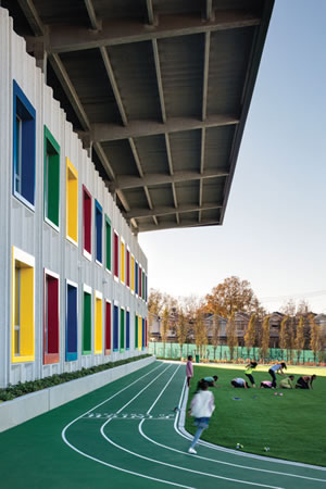
Elsewhere, a signature exterior for a
new school has also been gaining attention:
the Kathleen Grimm School for Leadership & Sustainability, or P.S. 62, on New York
City’s Staten Island. Architect Jon Cicconi
of Skidmore, Owings & Merrill, described
how constraints of budget and the goals of
the client, the New York City School Construction
Authority, spurred the effort to
design an unusually efficient and distinctive
exterior for the 68,000-square-foot
public school for 444 pre K-5 youngsters.
The authority emphasized the need for
durable materials throughout, including the
exterior, and stipulated a net zero energy
standard for Grimm, which is being used as
a test case for, as indicated, durability and
energy sustainability. According to Cicconi,
the typical route would been to construct a
brick exterior with a cavity wall, insulation
and waterproofing behind it. The
standard system also has masonry ties,
which he pointed out is a weak point for air infiltration. Instead, the designers opted for a system comprised
of vertically standing precast panels with no ties. With nothing
puncturing the air barrier but windows, the textured panel system
provides efficiency as well as aesthetic needs, he explains.

PHOTO © 2016 WAYNE CABLE
Additionally, the building’s orientation provided a low-tech step
toward efficiency: classroom spaces face north or south, positions
that are easier to protect from the heat of daylight. Along that line,
there are few windows to the east and west, areas of the school that
mostly contain mechanical and storage spaces. Those north and
south façades are about 30 percent windows, while the east and
west façades are about 7 percent windows.
Elsewhere along the exterior, photovoltaic panels are matter-of-factly
placed —“we didn’t try to hide them,” Cicconi says — with
the building, in fact, providing a canopy for the panels. And that
canopy helpfully provides shade for a playground area. Among
other features on the outside of the building, according to Cicconi:
site furniture, such as benches with bright colors that help extend
the theme of the building, whose window frames provide pops of
color along the façades.
As the architect sees it, the client’s requirements sparked
creativity that has resulted, in part, in Grimm’s signature, high-performance
exterior. Cicconi, speaking of those requirements,
says, “We tried to find design opportunities in those things,” and
in so doing, “we could create a form to optimize and synthesize” a
number of energy efficient and durable features.
Back at Kennedy-Curry in Texas, other features, like the aforementioned
sphere bollards, can extend a building’s and a campus’
identity outward in other ways. And it can sometimes be achieved
with panache and a touch of logical whimsy. For example, how about
sphere bollards that resemble basketballs, baseballs, and golf and
soccer balls for campus sports complexes? Suppliers including Belson
Outdoors, Markstaar and Quick Crete Products Corp. offer those. But
at Kennedy-Curry, the forms are subtler, with a color for the globes
foreshadowing the red brick of the building façade beyond.
At the risk of projecting too much, one can perhaps imagine the
functional line of barriers as suggesting planets and stars, which in
turn could suggest the sphere of the school setting itself, a universe
of discoveries, or the world of opportunities enabled by education. Be
that as it may, taking extra steps on the outside can indeed suggest or
more explicitly communicate learning and excellence on the inside.
This article originally appeared in the issue of .