Not Just a Pretty Face

PHOTOS © MATT WARGO
Expressing institutional identity, energy efficiency, design acumen and campus revitalization
all matter. No doubt about it. And new and renovated
building exteriors are opportunities to help express and achieve
those things, creating new options for colleges and universities.
It’s a dynamic being expressed in disparate projects and
locales. Take for example Thomas Jefferson University’s recently
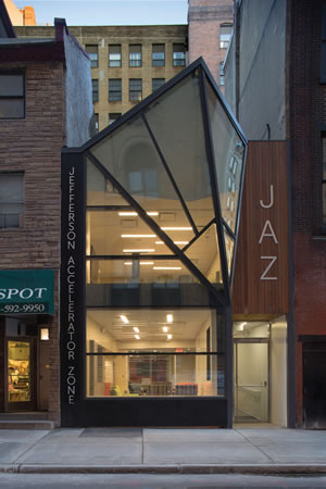
renovated Jefferson Accelerator Zone (JAZ), a medical innovation
facility in Center City, Philadelphia. For this recent project, architect
Cecil Baker + Partners worked closely with campus officials
to turn a nondescript two-story row house owned by the university
into an emblematic new structure.
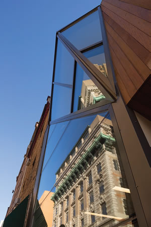
The exterior communicates ideas about local history and the
university, with the focal point a provocative façade in the shape
of a “kite-like projection.” It is a reference to the past, present
and future — that is, the kite of Benjamin Franklin as well as the
bold, innovative spirit of the new facility, the architect points out.
Technically speaking, it’s a “custom-designed structurally glazed
façade curtain wall system with tube steel structural support.”
The approach was multipronged, with the new look dramatically
changing the brick exterior of the pre-existing building and
boosting its energy efficiency with the new façade and roof systems.
Architect Chris Blakelock explains, “We used insulated glazing in
place of the uninsulated glazing and uninsulated masonry walls that were previously on the building. We
also added insulation to the roof.” The
architect describes another feature enabled
by the glass expanse: an attractive secondfloor
conference room with campus and
streetscape views.

PHOTOS © MATT WARGO
The building is now a standout for
exteriors on the campus. As Blakelock
continues, “The buildings in the heart of
the campus are typically masonry buildings,
some of them old and historic. The
materials we used for JAZ — glass and
steel — distinguish it from the bulk of the
campus buildings.”
Envisioning the exterior and the revitalized
structure it surrounds as a pragmatic
opportunity helps achieve several goals,
Blakelock says, including “updating the
image” of a historic campus, “providing
an identifiable presence on the block” and
providing “a gathering space unlike any
other on campus.”
Further, façades and overall building
envelopes can work in concert with other
exterior elements, sending a ripple effect
to their surroundings. In the case of JAZ,
there is a beacon effect along the city block
at night as light emanates through the glass
curtain wall. This provides “the opportunity
for after-hours use,” Blakelock points out.
“Having more people and light on the street
after dark adds to the vitality of the neighborhood.”
The broader effect of the entire
design, he adds: a benefit to “the real estate
of the whole block and larger neighborhood.”
Utilitarian Beauty
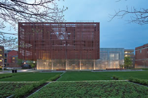
Another project, seen above, used an
energy-efficient, distinctive building envelope
with other elements to turn a routine
type of campus building, a chiller plant,
into a provocative design statement on the
main campus of The Ohio State University
in Columbus. There were a couple of important
things at play with the exterior.

PHOTO © BRAD FEINKNOPF
First, there’s the plant’s “high-performance
envelope, including translucent
fritted double glazing and insulation,”
explains its architect, Jane Weinzapfel of
Leers Weinzapfel Associates, who points
out that in addition there is an “upper
cantilevered perforated metal screening of
rooftop equipment.” The screening “shades
the glazed building below from sun on
most of the south, west and east exposures;
this protects the lower glazed volume
effectively from summer heat gain, even
without requiring a low-e coating.”
One of the other goals, she says, was “to
screen the equipment within the building,
while making an attractive open gesture
suitable to an actively used student area.” The
glazing, Weinzapfel points out, “gently glows
at night with minimal interior lighting, creating
a sense of safety and liveliness surrounding
an otherwise low-occupancy building.”
Secondly, there’s the fact that the chiller
plant is sited at a strategic, high-profile location
on the campus, raising another key point
about the right exterior. As Weinzapfel explains,
“Often in the past, utility buildings and
chiller plants were located at the back edge
and sometimes hidden parts of campuses. As
campuses have matured and densified, and
as town development has crept to campus
borders, existing plant sites have become more
prominent and sensitive. As additional utility
capacity needs increase dramatically with
campus growth, the best new sites also are
often located in sensitive prominent locations. Recognition of these needs is indeed gathering force and attention.”
The effect is more than the sum of its parts, with Weinzapfel putting it this way:
“Façade materials and lighting can give a
sense of dynamism and activity or a sense of
continuity, repose and contemplation. The
key ways that campuses can use exterior elements
and façades to support student life is
by choice of materials, color, scale of elements
and spaces, connections between buildings
and landscape, and appropriate lighting.”
She adds that “exterior elements, including
canopies, portals, porches, lighting, seating
steps or benches can support social comfort,
and a sense of protection and safety.”

PHOTO © BEN GANCSOS
Sealing the Envelope
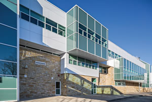
At the State University of New York, Old
Westbury, a major renovation involving
exterior metal panels, a glass curtain wall
and other elements came together to bring
something new to a marquee building: the
Campus Center, seen on previous page.
The exterior marshaled “state-of-the-art
insulated glass throughout the entire
project,” says architect Marc Spector of
Spector Group, with the glass, which is
double glazed, “replacing an antiquated
single-glazed system.” Additionally, the
metal panels are part of “a highly insulated
sandwich system that provides excellent insulation
value,” he continues, with “the two
new systems, glass and metal, working in
conjunction provide much tighter envelope
than the previous system, thereby creating
a much more energy-efficient envelope.”
The approach brings up pragmatic communicative
aspects as well. As Spector says,
“The building is now what it was designed to
be: the gateway to the school,” with facets of
the design carrying that idea further, mainly
via glass bridges that metaphorically reach
out to building users while enabling efficient
circulation for pedestrians.
As Spector sees it, the Campus Center “exemplifies
the trend toward creating energy-efficient
envelopes that at the same time are
visually exciting. The front façade is a case in
point. The addition of a stone façade element,
curved mechanical screen and the glass-enclosed
bridges create an exciting visual effect
that greets the visitors upon arrival. The
glass bridges are inviting entry pieces that
catch the viewer’s eye both day and night.”
All told, those recent campus projects
are among those with exterior designs and
materials that are creating new options
for higher education institutions, their
campuses and surroundings — things that
matter. No doubt about it.
This article originally appeared in the issue of .