Come Inside
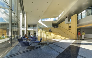
PHOTO © JAMES STEINKAMP PHOTOGRAPHY
There's much happening in terms of the
interior design of Case Western University’s
award-winning Tinkham Veale University
Center. But make no mistake, its furnishings,
forms, floors and finishes come together
seamlessly to present a design solution as
compelling as it is practical.
Among the features: elegant floors defining
spaces and the movement through
them, pale wood finishes interspersed with
vivid colors, cozy conference rooms with
an air of prestige, subtle partitions in otherwise
open areas and a two-story-high interactive
media wall, all of which are situated
in a grand, flowing space with a chic
but easy vibe. This place serves as both a
thoroughfare and a destination on the university’s
Cleveland, OH, campus.
Opened in 2014, the university center,
with 89,000 gross square feet, is a $50-million, donor-funded building that consolidates
numerous functions, pulling
them to a well-used spot in the middle of a
changing, growing campus.
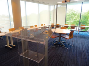
PHOTO © SCOTT BERMAN
Designing a Place for Everyone
The high-profile central campus site,
which unites different campus areas, called
for a variety of responses. As Stephen Campbell,
the university’s vice president of Campus
Planning and Facilities Management,
told College Planning & Management magazine
during a tour of the center, “Part of the
challenge was to create not only a place for
students, but to create a highly flexible space
that could adapt for development functions,
commencement” and various activities.
The building, which targets LEED Gold, replaces a repurposed student center elsewhere
on campus and houses various administrative
and student organization offices,
a restaurant and bar establishment
that also serves as the faculty club, a ballroom,
conference rooms, a food court and
various student spaces, all beneath a sloping
green roof. The center encloses the route of
what was an outdoor walkway for students
between the campus’ residence halls to the
north and classrooms to the south, explains
Campbell. That walkway is now inside, a
route assumed by the expansive concourse
through the university center. So, proverbially
speaking, the building is much less
about “build it and they will come” than it
is about “build it where they already were.”
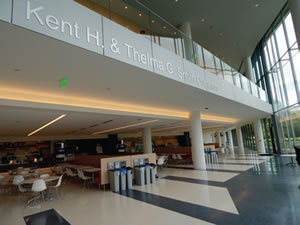
PHOTO © SCOTT BERMAN
Architects Mark Walsh and Mark Jolicoeur,
members of the design team at the
project’s architectural firm, Perkins+Will,
describe the building as one that exudes
transparency, connectivity and openness.
As the firm says, the building is designed
to “foster greater interaction and collaboration
among students, faculty, staff and community.”
Such intentions enable a variety
of uses, with Jolicoeur calling the building
essentially a hybrid student and university
center with “one foot in each.” Cleveland’s
CBLH Design, which provided construction
administration support, puts it this way:
“The design is built around circulation” with
the building exuding an “always open” feel
with various spaces for “social and cultural
engagement.” The construction manager,
incidentally, was Donley’s, Inc. of Cleveland.
The Value of Student Input
Designing the interior took some doing,
with the process including students’ input
about the kind of amenities and functions
they wanted — Jolicoeur describes a visioning
session and programming meetings
“before any drawing was done.” Students’
comments and questions revolved around
the building’s sustainability, openness,
food choices and student organization office
space, he points out. Campbell, meanwhile,
notes that the most prevalent request from
students, perhaps surprising to an outside
observer, was for places to study.
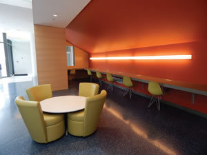
PHOTO © SCOTT BERMAN
How the interior design responds became
evident during a 2015 tour of the
university center. This is a sleek, comfortable
space that is clearly a showpiece for
the campus. First, there’s the thoroughfare,
which traverses the length of the building.
The thoroughfare passes a dining area
and a setback line of food service choices
that bring new functions and retail to the
long-established campus route. Color delineations
on the thoroughfare’s expansive,
high-gloss floor suggest not only the main
route but also, at angles, offshoots to and
from the dining area. Overlooking this is a
large, inviting, nine-tier set of bleachers in
pale wood. The seating is part of a large set
piece, so to speak, that also has a staircase
and a high expanse of matching paneling.
The piece has another function: tucked
behind and beneath the bleacher-stairs is
a quiet, well-lit space equipped with soft
and hard chairs in an olive tone, and a bold
dash of bright color. The furnishings are arranged
for group and individual work.
Such elements reflect how students use
campus spaces, Campbell explains, in the
sense that “it’s important socially that they
can walk through a space, see a group and
without committing to it, walk past or join
the group. The space gives them that option,
and not be socially awkward.”
On a related note, near a student activities
suite, there are upholstered chairs — every
two chairs share one table — with backs
high enough to serve subtly as privacy partitions
and conversation sound buffers.
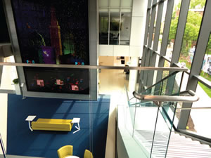
PHOTO © SCOTT BERMAN
A Welcoming and Flexible Space
Elsewhere, along a perimeter wall, is Michelson & Morley, a restaurant/faculty club
whose interior was designed by Cleveland’s
Van Auken Akins Architects. There, interior
elements reference and gently diverge from
other elements in the building to create a dining
venue with what the architects describe in
part as “a warm and welcoming ambiance.”
As the Michelson & Morley firm points out on its website, included are varied ceiling
heights, colored LED lights, a glass curtain
wall between indoor and a wood plank deck
that enables outdoor dining. Inside, there is
dark ceramic floor tile and attractive upholstered
seats to match, with the main furniture
vocabulary in a fine, pale wood that, along
with the much of the ceilings and walls, echoes
the wood of the aforementioned bleachers.
Another key feature: spaces for large
events, including formal ones, on the second
floor that can be divided into smaller venues
with retractable folding partitions — Campbell
notes that the automatic partitions are
supported by a steel beam so long that it had
to be ordered from a Belgian foundry — and
glass curtain wall on every side of the building.
There is also that large media wall mentioned
earlier, which has Cleveland-themed
and other images and messages. It’s an interactive
aesthetic that provides, among other
things, a high-tech “wow factor” for prospective
students and their parents. The screen itself
fronts a wall that indicates another space
within the whole: an elegant lounge with
carpet and soft seating facing the screen and
completing the ensemble.
Those and other facets together make an
iconic architectural statement. Finally, iconic
doesn’t get in the way of practical: Take for
example, the amount of activity within the
center on a daily basis — aside from plenty
of traffic, 720 events the first semester and
1,500 the second semester — Campbell
points out. Feedback on campus has been favorable,
and all told, he adds, the new campus
icon “has been heavily used. And I think
it achieved the initial goals. I know it did.”
This article originally appeared in the issue of .