Interior Insights
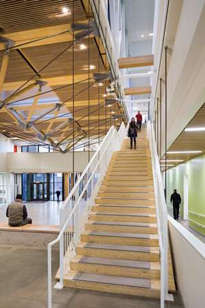
PHOTO © ALBERT VECERKA / ESTO
Today, welcoming, light-filled, energy-efficient campus spaces that encourage social interaction as technological needs expand and sustainability and energy efficiency expectations grow are a must. “Universities are trying to get the most bang for their buck, in architecture as well as in furnishings and materials,” says Leers Weinzapfel Principal Tom Chung. “They want sustainable buildings because they’re less expensive to operate and because students care. And they’re looking for spaces that are multifunctional, too.”
Leers Weinzapfel Associates (Boston), an AIA Firm of the Year, practices widely in higher education design, from chiller plants to classroom buildings, performing arts centers to research facilities. Nationwide, the firm notes that colleges and universities across the board now face the dual challenge of attracting and nurturing the best and brightest students while budgets simultaneously contract, affecting building design as well as interiors.
Private sector spaces are also influencing academic interior design, according to Chung. “Different spaces have different expectations, but everything from the selection of the flooring and the furniture to wall surfaces can contribute toward a space that feels fresh and new,” he explains. “There are concrete floors, and exposed mechanical systems in the ceiling. Within that, you’ve got strategically placed feature elements that provide pops of color and texture to tie it all together.”
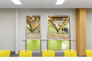
PHOTO © ALBERT VECERKA / ESTO
Attentive to these challenges — and opportunities — two of Leers Weinzapfel’s recent projects, one new construction and the other a renovation, provide dynamic learning environments that reflect these trends.
Design Building, University of Massachusetts Amherst
Completed early this year, the Design Building at UMass Amherst is America’s first cross-laminated timber (CLT) academic building, designed for LEED Gold certification. Conceived as a highly sustainable teaching tool, the project brings together the previously dispersed architecture, building and construction technology and landscape architecture departments to promote synergized learning. “That drove our conception of a building with a center: an interior atrium that would represent coming together,” explains Leers Weinzapfel Principal Andrea Leers.
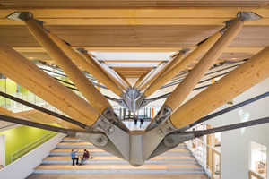
PHOTO © ALBERT VECERKA / ESTO
Clad in an envelope of copper-colored anodized aluminum panels and vertical windows, the Design Building is open on one side, allowing entrance through this large central commons, which is illuminated by skylights and surrounded by a multistory, glass-ensconced perimeter. “We designed it so all the offices, classrooms and studios open into it,” Chung says, “to make you want to look at the other departments and what they’re doing.”
The atrium not only brings people together but also helps bring natural light to the innermost classrooms and offices flanking it, giving occupants a shared sense of purpose. “It’s opening up the building and its many activities to everyone,” Leers explains. “There’s always a struggle between having enough vision and literal transparency and having enough walls to pin things on and provide acoustical separation. But there’s no question a series of closed-off rooms, however beautiful, is not how we think of interior space today. We think much more about the dynamic of layers of space than we do enclosed rooms.”
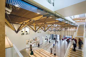
PHOTO © ALBERT VECERKA / ESTO
The building’s design makes a kind of theater from having maker spaces such as wood shops and fabrication laboratories visible on the ground floor through glass walls. “Everybody loves to look in on them,” Leers says. Along with a ground-floor café and exhibit areas, she adds, “all of that really flows into the landscape and invites people in.”
A great space also has to sound right. Though many of the building’s primary interior surfaces are hard, such as concrete flooring and wood ceilings, “There are absorptive fabric-wrapped panels and ceiling materials, and carpeting where needed,” Chung explains. “The main ceiling and soffits in the corridors: those are all acoustically treated with ceiling panels or with wood slats with acoustic spray that makes the ceiling plane really sound absorptive. The ceiling is one of the more important planes in terms of mitigating noise.”
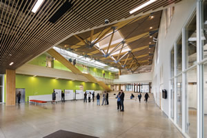
PHOTO © ALBERT VECERKA / ESTO
Unlike some projects, luxury and highly refined materials were not the goals for this building, according to Leers. “Everybody just wanted great space,” she says. “We have mostly concrete floors. Thinking of it as a rough-and-ready dynamic workspace, the finish materials are really suited to its use and to the goal of getting everyone together,” she says. The building’s wood construction and exposed structure also proffered savings on finish materials. “The structure itself is the finish, and that’s very sustainable,” says Chung. “You don’t have to spend money to cover up a concrete or a steel structure.” The firm added an accent wall to add vibrancy to the central space. “We have a big painted green wall that lines the stair wall with a lot of daylight above,” Leers says. “Then we’ve used other accent colors. Color is there in an economic way to carry through the intention of being in nature and being vibrant.”
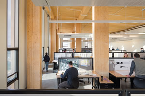
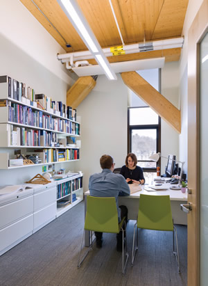
PHOTO © ALBERT VECERKA / ESTO
Embracing environmental concerns, the firm continually seeks to use furnishing materials sensitive to the environment. “Upholstery can’t off-gas, for example. It’s usually treated for durability with chemicals,” says Chung. “We have to make sure those formulas are green. And we try to use recycled materials as much as possible.”
Furniture selections for the Design Building were specifically focused on well-designed, flexible choices including simple, stackable, rolling Caper chairs from Herman Miller. To add visual interest, the firm chose a palette of paint colors born from the surrounding landscape.
“We thought of the university in a heavily forested area for the furniture colors — the yellow, the oranges — and about what happens in this area in the fall,” Chung explains. “That accent really played well against the natural materials.”
Sophia Gordon Center for Creative and Performing Arts, Salem State University
Just 100 miles east of the UMass Design Building, Salem State University’s Sophia Gordon Center for Creative and Performing Arts demonstrates how an old building can be reborn on a budget. “It was a shoestring undertaking, but transformational,” Leers says. Here too, the key to design was flexibility.
Originally constructed in 1958, the building’s 650-seat auditorium was too big for most performances yet had a small lobby, and it lacked rooms for rehearsal, props and tech. The building also looked uninviting from the street, with an oppressive blank wall above the entrance. Leers Weinzapfel moved the entry to a new side courtyard that doubles as outdoor performance space, while wrapping the facade in a dynamic perforated screen.
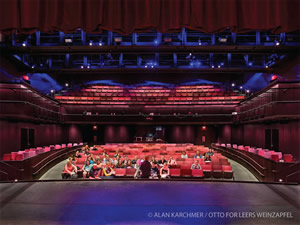 Designed to achieve LEED Gold certification and to use energy 20 percent more efficiently than code requires, the Gordon Center’s interior redesign includes a smaller 490-seat theater — saving space for both a larger lobby (it too can host performances) — and a 120-seat black-box theater on the second floor. A new underground level comprises dressing rooms and stage preparation with an elevator, allowing full professional productions. “It’s a three-dimensional puzzle of stacking and reorganizing spaces within the existing volume,” says Chung.
Furniture and textiles throughout the building were chosen for their timelessness. “We have to be mindful that what we choose doesn’t look dated in seven or eight years. In retail, they switch these out every year, but at universities, they don’t have the resources to change surfaces and interiors often,” Chung says. “So, we resist big patterns and go for something more muted, and we go for textures instead of a flat appearance to give more of a sense of plushness.”
The new lobby’s furniture typifies the flexibility-oriented design of the project, able to accommodate class scenarios, receptions or even performances. Its multifunctional tables raise and lower to serve as coffee tables or high-topped dining tables, while work counters can accommodate students studying or act as serving tables for an after-performance gathering. “This goes back to everybody looking to get the most out of that investment,” Leers says.
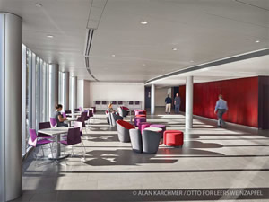 A few well-placed materials with texture can go a long way. While many walls at the Gordon Center are basic painted drywall, for example, the eye naturally gravitates to one wall clad in dyed wood panels. “You’re concentrating your resources to make the most impact,” Chung explains. “In the Design Building, we did something similar. We concentrated our resources in the wood slat ceiling, hiding some of the big heavy equipment and ductwork.”
Since the Gordon Center opened in January, the facility has become a magnet not only for theater students, but for the entire campus. “People are hanging out there because the lobby is inviting,” Leers says of the facility. “The university is getting a lot of mileage out of this very modest investment. And that’s the big overarching goal we have discovered in all campus design today: do more with less.”
Perhaps it’s appropriate that one of these campus buildings is for design students and the other for theater, because the interiors Leers Weinzapfel created at UMass and Salem State each combine smart, economical thinking with a refined sense of drama, performance and longevity. These are wide-open interiors meant to wow us, but flexible enough to wow in different ways depending on the day, the hour, or the year.
“We look at the overall concept in terms of interior decisions. Does it reinforce the architectural principles?” Chung says. “If it does that, it will stand the test of time.”
This article originally appeared in the issue of .