Great Opportunities to Inspire
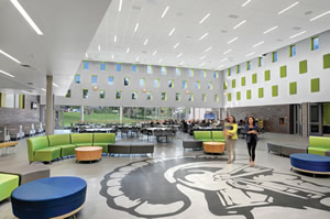
PHOTO CREDIT DESIGN ARCHITECT RB+B ARCHITECTS / PHOTO BY TIME FRAME IMAGES
Educational interiors today are enabling collaborative learning, making statements with attractive colors and furnishings, recapturing and celebrating their school’s heritage, educating in virtually every space, and foreshadowing the learning and working environments in the futures of so many students. School Planning and Management looks at some standout examples that are telling of trends.
Key aspects of the interior of Kelly Walsh High School in Casper, Wyo., indicate some directions for schools today. Matt Arabasz of the building’s designer, RB+B Architects, notes the move toward more “presentation spaces, medium and small group break out spaces, spaces for individual work, and outdoor spaces…as important as traditional spaces for large group direct instruction.” He says Kelly Walsh reflects such movements in that it is “visually open, supports a wide variety of learning settings, and the material and color palette is intended to be more representative of current workplace design.”
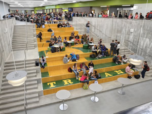
PHOTO CREDIT DESIGN ARCHITECT RB+B ARCHITECTS / PHOTO BY TIME FRAME IMAGES
That color palette is simple, bold and “non-institutional,” he says, and there is furniture that “creates a wide variety of learning settings, from formal, direct, large group instruction, to small group collaboration, to pairs of students, to individual students, and includes adjustable height tables and chairs, café style seating, bench style seating, booth style seating, overstuffed chairs, and beanbags.”
Among the interior design’s other driving themes: sustainability in materials and finishes, and safety, which at Kelly Walsh, as Arabasz explains, is in the form of “visual transparency and physical openness to foster community.”
Construction costs require that “every square foot of space in a school serve an educational purpose. Most modern schools have very few corridors, hallways, or other areas dedicated solely to circulation — most have widened these areas, elevating them from ‘passageways’ to ‘main streets,’” where collaboration and learning take place.
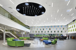
PHOTO CREDIT DESIGN ARCHITECT RB+B ARCHITECTS / PHOTO BY TIME FRAME IMAGES
Significant overhauls aside, lighting and color schemes can work with details to add much visual interest to interiors. It may be as simple as light attractively highlighting the nooks and crannies of a split-face cinder block wall, as in the auditorium of the new Wheaton High School in Maryland.
Another interior takes its inspiration from the past: that of Rapid City High School in South Dakota. The recently renovated and expanded alternative school, created in two phases from and in addition to a grand building many decades old and on the national historic register, points out Architect Kristine Bjerke, principal of Architecture, Inc. The new building now has, among other things, a completely restored and updated community theatre — the district worked with the local community theatre group and Jerit/Boys Inc., Chicago, was theatre design consultant — and a new section with classrooms, an administrative office, a secure entrance and a studio theatre. Bjerke said that given the status of the building, the interior design approach at the school was “to bring it back to its historic look as much as possible,” and to do so, Bjerke and her colleagues often had to work from old photos.
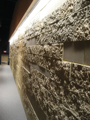
PHOTO © SCOTT BERMAN
Finishes and details include painstakingly restored ornament, preserving some theatre seats and lighting fixtures — some new, matching fixtures were custom made — applying vinyl whiteboard surfaces to old blackboards, adding HON furniture, among others and revealing ceiling moldings, brackets and woodwork.
As Bjerke adds, “If you’ve got some good finishes, it’s totally possible to preserve the original feel. And when you do an addition, you can modify that, but keep it going.”
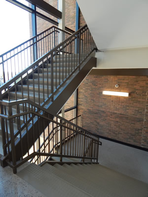
PHOTO © SCOTT BERMAN
Likewise, a fresh, attractive interior inspired in part by its predecessor pops at Paris High School in Illinois, a 135,000-square-foot, $39.7-million high school designed by BLDD Architects. Opened two years ago, the school replaced a 106-year-old high school. The new library, like the old one, is located near the building’s center, and there are long stretches of attractive terrazzo in hallways. Still, “this is different,” then-Director and Principal Dave Meister said. There is the interior’s warm, attractive orange color scheme, which appears in various tones on walls, lockers, sections of the terrazzo and soft furniture.
The color adorns hallway-learning spaces that students suggested as part of a teaching assignment early on in the process, according to Meister. The spaces, a sign of how many schools are marshalling almost every space for education, provide hallway transit, of course, as well as a gathering area for students to interact and collaborate, and in at least one instance can form an extended learning area when teachers open a Nanowall between the space and an adjoining classroom. During a tour just before the school opened its doors, workers at that spot unpacked and set up furniture, including pieces they identified as being from National and Wisconsin Bench, on carpet tile by Tandus.
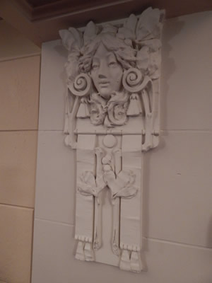
PHOTO © SCOTT BERMAN
Interior inspirations can come from outside a district, of course: take Penn-Trafford High School in Pennsylvania. Elements of its interior — part of a $31-million renovation and extension project — were suggested not only by students and the community, but were also sparked during a visit by school officials and an architect to the campus of Pennsylvania State University, explained Scott Inglese, assistant superintendent.
The result at Penn-Trafford: A central library area — also called a media center or learning commons — features a ring of independent, glass study rooms, each in its own vibrant color, and includes a coffee shop with soft furniture, all beneath a large skylight. It is the center of the bustling school, an expanded, 21st-century version of a similar, popular space in the old building. It is a layout that suggests university settings to come for so many graduates.
Similar ideas are woven into the interior of the $51.7-million renovation of East Hampton High School in Connecticut, which re-opened in September 2017. SLAM Collaborative’s Richard Herzer and Eleana Lynch say that the building’s different furniture types, transparency, natural light, learning technologies, and accommodations for group style learning are all part of the comprehensive equation, as is a focal point of the building: a team-based learning center.
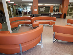
PHOTO © SCOTT BERMAN
They explain that the learning center, a space that was carved out of a section of an old gymnasium, is a higher educational type environment that has trickled down to K-12. The well-appointed center can accommodate 60 students at a time, and can house distance-learning sessions and other functions. According to Herzer and Lynch, the semi-circular shape of the room encourages student interaction, as do marker board surfaces, which appear on desk fronts on each tier of the space; the idea being “that you can change the purpose of the room almost instantly” from a lecture hall to a collaborative learning space.
Herzer and Lynch describe another feature at East Hampton High: “nooks in the corridors for independent study or a brief teacher-student conference” enabled by stepping out of the flow of hall traffic. It’s all about reflecting how many districts are teaching and learning, and about educational settings in and out of classrooms.
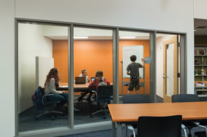
PHOTO © SCOTT BERMAN
As RB+B’s Arabasz adds, a school’s interior “expresses our values. An open environment says, ‘I trust you,’ display space says, ‘your work is important to me,’ connections to the exterior, environmentally preferable materials, and energy efficient building systems say, ‘there is an important relationship between this building and the natural world.’”
All told, there is much to aspire to, and great opportunities to inspire.
Two suggestions from experts:
- Consider where education can happen. As RB+B’s Arabasz says, “what happens between dedicated learning spaces is just as important as what happens in the learning spaces themselves.”
- Create balance. SLAM’s Herzer and Lynch explain that the right size spaces and clearly organized spaces and circulation must combine with “technology, new ways of teaching and the diversity of students and how they learn.” Interiors can enable “choice and the freedom to move around and learn.”
This article originally appeared in the issue of .