Signs of The Times: Utilizing Graphics to Safely Transition Back to School
COVID-19 has upended the “norm” of our daily lives. Even in preparing for the return to “normal,” considerations to prevent an event from affecting us to the same degree will have to be studied. The coronavirus has changed how we interact with everything and everyone around us. As we return to work, school, stores and beyond, we must relearn how to interact in the spaces we occupy. Familiar spaces will take on new protocols and we will have to adapt our behaviors for the safety and wellness of ourselves and our communities. From this, new practices and habits in our old environments will need to emerge in response to COVID-19.

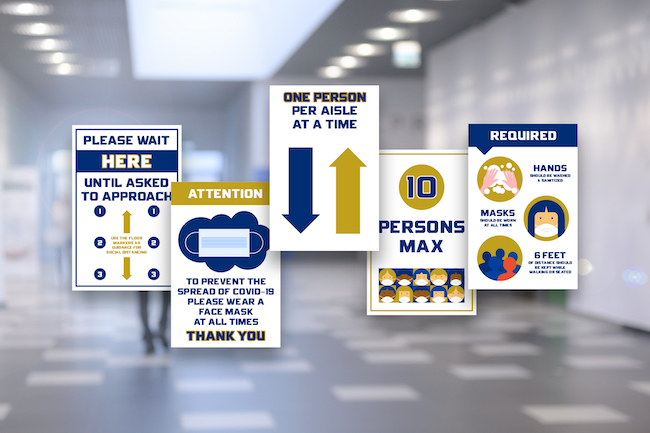
Illustrations By Chelsea Lott, Graphic Designer (PBK)
Because of the necessary adjustment to unlearn old habits, graphics will play an integral role in this transition. Overall, signage provides a cost-effective and direct solution to the question, “How does the coronavirus change our schools?” Signage plays a role in helping people feel comfortable in their environments and understanding what is expected of them in certain spaces. So, what constitutes effective signage? Here are a few key attributes:
Less is more
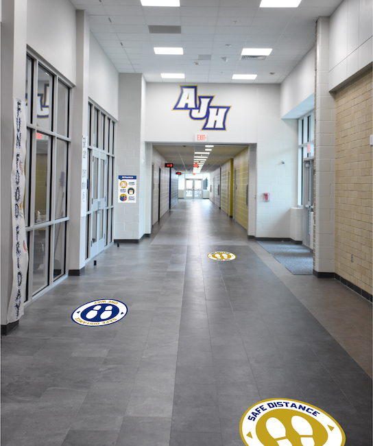
The quantity of signage should be considered. A large amount of smaller signs posted around a school or office are much less effective than a few larger signs posted at high-traffic areas. The idea is to draw attention and deliver information quickly. In a school, the key purpose of COVID-19 signage will be to manage gathering areas that often contain the most people, such as libraries, gyms, cafeterias and playgrounds, as well as those that see a lot of traffic such as building reception areas and hallways.
Know your audience
Your audience will help determine the best wording, size, placement and color of the signs. For an office, the purpose of signage will be to remind employees of new protocols and alert visitors of in-office expectations. In an elementary school, signage would ideally include less wording and more imagery and/or icons. Signage for elementary aged students would differ from signs created for high school aged students. For elementary students, we need to cater to what they already know. Instead of more adult directives like “stop the spread of coronavirus,” keep the verbiage age appropriate with phrases like “stay healthy, keep your friends healthy.” As the age of your audience increases, you can introduce more technical wording.
Be approachable
Signage should not be intimidating or negative. It should be clear and helpful. In terms of color, we need to avoid too much red, which can give a feeling of fear or danger. For younger children, use brighter colors to grab attention. For adults, use more mature colors such as grays and blues. As in any graphics package, it is appropriate to pull in colors from a school’s logos or branding to make it more personal and customized to that campus.

Illustrations By Chelsea Lott, Graphic Designer (PBK)
COVID-19 signage should be a helpful addition to any public place, whether it is a school, workplace or retail store. As life resumes and signage abounds on every door, at every checkout line and in every elevator, the graphics that we encounter should draw attention and be purposeful. Because there is so much unknown, these signs and their messages will be an ongoing learning experience. Signage is a comparatively low-cost solution and can be a simple way to provide security in a constantly changing world.
About the Author
Ashley Kolar is the Director of Graphic Design at PBK. Ashley works with architects and clients to bring a sense of identity and fun to projects through colorful, educational graphics. She has nine years of graphic design experience and uses her art background to bring client ideas to life. Ashley loves to help bring even more color and excitement to PBK projects and being part of a team that helps make schools a fun place for students.