Furnishing and Equipping Student Spaces
PHOTOS © PAUL JOHNSON
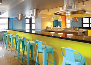
SOCIAL NETWORKING. One aspect of furnishing the New Yorker Hotel Student Commons was a decision to replace small and isolated satellite cooking facilities and lounges embedded among dorm floors with large, vibrant, multi-faceted spaces complete with cooking, dining, library, recreation, film screening areas and more. The resulting design for the project is casual, with a multitude of places to “hang out.” The cooking facilities and lounges vibrate with a lively palette of paint, tiles and paneled cabinets.
As college and university students increasingly seek living environments more like boutique hotels than the childhood bedrooms they left behind, facility administrators and interior architects are actively working to meet their new criteria. Like their parents, students today crave good design, not condescension, and the offerings and selection of furnishings and equipment for campus common areas are changing to reflect this trend.
While our practice primarily designs student commons for urban schools — many in high-rise buildings — the desires and challenges for these spaces are largely ubiquitous. For all, the sweet spot lies in making them safe and durable yet non-institutional in feeling. They must be grown up, but at the same time fun and hip. They should be social, with a variety of places to hang out and experience a myriad of activities, and being networked and “plugged in” is a given. Safety is also crucial, enhanced through effective security camera systems and a minimum of isolated rooms and hidden crannies.
Planning Spaces
The first thing we consider in student commons projects is the look and feel of a space. Reaching beyond requested spatial “branding,” we borrow a trend from restaurant and hotel design and also embrace the inherent character
of the neighborhood through our interior treatments as well as the furniture and equipment we select. These decisions are magnified in student spaces, as unlike selections made for a typical residential setting, these must not only complement the project’s aesthetics but also provide strong functional performance. Aside from meeting our aesthetic criteria, the two standards we live by when it comes to the selection process are durability and comfort.
Durability. The key here is finding a balance between longevity and cost. It is not easy to find stylish furniture that fits this description. This is why “institutional” choices tend to be the norm, though we consistently seek to avoid the mundane whenever possible. Furniture in these spaces also gets moved around frequently, resulting in the loss of sofa and coffee-table legs. Therefore, whatever is placed in the space also needs to be inexpensive enough to be replaced after a mishap. And it goes without saying that kitchen equipment must provide longevity, as well.
 Comfort. Furniture needs to be comfortable for the user and ergonomically sound to meet specific functions such as studying or dining. We also seek designs that comfort the user in a visceral sense, providing friendly visual appeal.
An Uncommon Commons
These design standards are readily apparent in our most recent project for New York City’s Educational Housing Services (EHS), the New Yorker Hotel Student Commons. Located in an historic 43-story art deco hotel in midtown Manhattan that is now a Wyndham, the project occupies a 24,000-square-foot full floor, serving as a hub for the 600 students who reside on “our” floor and five others. (The majority of the remaining floors serve hotel guests.) The Commons addresses EHS’s ongoing efforts citywide to replace small and isolated lounges and satellite cooking facilities embedded among dorm floors — a problem not unique to urban schools — with large, vibrant, multi-faceted spaces complete with cooking, dining, library, recreation, film screening areas and more.
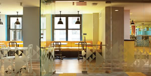
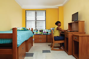 Our casual design for the project comprises a multitude of places to “hang out” as well as new dorm rooms converted from former hotel rooms. All of the areas are separated by floor-to-ceiling glass to allow for acoustical (and in the case of the kitchen, olifactoral) separation, while providing a visual sense of openness.
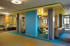 The vibrant, graphic color palette we chose for the space echoes the building’s energetic urban surroundings, interpreted for its young end-users. This environment, along with shape, color and texture all came into play when we were selecting furnishings and fabrics. As textile technology continues to improve, luxurious fabrics — even glamorous velvets — that might have previously been found solely in residential or custom high-end hotel design are now appearing as commercial-grade products. The same is true for carpets, as very durable and inexpensive broadlooms and carpet tiles have begun to surface. These materials lend a fresh sense of sophistication to our designs, helping us to meet students’ high expectations.
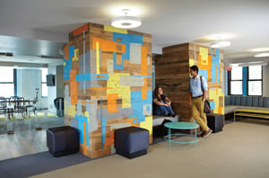 Considering the New Yorker’s spaces, its lounges required a variety of seating scenarios to meet diverse needs. Ergonomics and comfort played key roles in making these decisions. We specified custom-made sofas for the TV lounge to maximize a “living room” feeling. Long, built-in banquettes are versatile for large groups as well as for sitting upright or reclining. The library study tables and chairs provide room to spread out schoolwork, while individual lounge chairs and side tables are conducive to reading a book or tablet.
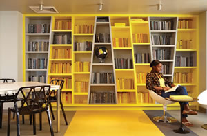
The library, defined as a place to study and absorb knowledge, features whimsically canted shelves with books that echo the color story and also spatially signal that this is not a noisy place. In the adjacent lounge and game area, we dropped a floating ceiling plane above a seating and TV alcove to give it a special sense of place. We then disguised a multitude of plumbing shafts left over from the hotel rooms as integrated “furnishings” themselves by covering them in reclaimed wood, adding individuality through the addition of “graffiti” art stenciled into them by a local artist.
Kitchen and Cooking Spaces
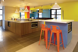 EHS has experimented with different types of cooking facilities over time. The New Yorker’s is simple and limited in function: cooktop and microwave cooking only, without storage for food or utensils (students bring their own to the space). This facility is filled with activity day and night, as students tend to come in pairs or groups and make their cooking and dining experiences a social outing. Continuous eating counters parallel to the cooking lines serve this purpose well. The cabinets have solid core panels made from a sustainable material also used for building exteriors, and the countertops are made from a highly durable engineered material made of recycled crushed stone. The floors are porcelain tile. The nearby dining room offers a myriad of table sizes and banquette seating as well as chair seating, again, to suit a variety of student preferences.
Today’s higher education student commons should be signature spaces that meet client requirements as well as the desires of an increasingly sophisticated student population. Open, versatile, space planning and careful attention to furnishing and equipment decisions can elevate these projects into affinity building environments that are far from conventional.
This article originally appeared in the issue of .