Reading the Signs

PHOTOS/IMAGES COURTESY OF MICHAEL COURTNEY DESIGN, INC.
Every campus depends on signs to provide key info for students, staff and visitors. Historically, development of signs at many institutions has followed a less than unified approach. But college leaders are now finding that a signage program focused on branding and wayfinding offers new opportunities to create engaging and memorable experiences.
The Branding Bonus
Of course the primary purpose of any sign is to inform, but it can also do much more.
“First and foremost, a signage program is a service to the campus population,” says David Vanden-Eynden, principal, Calori& Vanden-Eynden Design Consultants, based in New York City. “The fact that it also serves a branding function is a bonus.” He says that a well-conceived and -implemented signage program, while making the campus easy to navigate, reinforces the school’s brand while enhancing the user experience.
Vanden-Eynden points to recent work at Rockefeller University in Manhattan, where his firm helped develop a signage program designed to make the campus more accessible. New wayfinding and identification signs, along with directory maps, were all branded with the university’s name and medallion. Most importantly, they made the campus easier to use and navigate. At the same time, a simple, contemporary sign design spoke to the university’s forwardlooking philosophy, while construction materials were selected for consistency with the historical look and feel of the campus.
Such efforts typically represent a significant change from past practices.
“Not too many years ago, people in the sign industry would laugh when told by someone on a college campus that the sign design for the current project was going to be the new campus standard,” says Randy Goodfred, director of design services at Poblocki, a Milwaukee-based sign company. “We had heard that phrase so many times, and yet that design never once became the standard.” Recently, however, more and more colleges and universities have been implementing comprehensive sign systems designed not only to direct and identify, but also to integrate with the branding of the institution, Goodfred notes.


PHOTOS/IMAGES COURTESY OF MICHAEL COURTNEY DESIGN, INC.
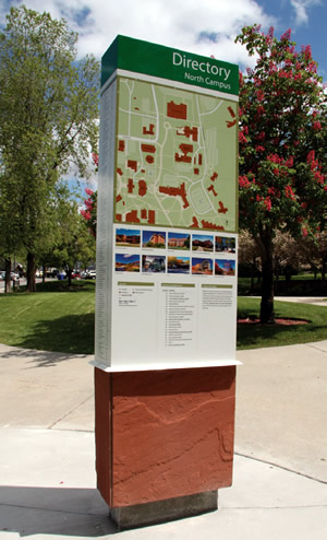
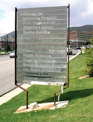
BEFORE AND AFTER. A well-designed campus signage system is an important component of an institution’s branding. A good signage program provides viewers with immediate identification of your identity. A consistent, planned-out program is key to signage success.
“Even small campuses will have dozens of exterior signs and thousands of interior signs,” Goodfred says. “The repetition in color, shape and layout quickly becomes familiar and expected, and therefore more effective.”
Michael Courtney, who heads up a like-named design and marketing communications firm based in Seattle, also points to an evolving focus on the importance of signage from a branding viewpoint.
“Where we once dealt primarily with team members from the planning and campus architecture departments, recent teams include representatives from marketing and licensing,” he says. “This is a welcome additive. We believe a sign program is an integral part of the overall brand and needs to be consistent with the collateral materials, website and marketing communications.”
Courtney says his team uses the phrase “concierge” to describe the role of branding and wayfinding on campus.
“A good signage system greets, guides, informs and enhances the user experience, just like a good concierge in a hospitality setting,” he notes. “Our clients are seeing the value of developing an engaging campus system to connect with all the people who use the campus system — students, parents, faculty, donors and community.”
Frequently, well-designed maps complement other types of signs. For campuses with a number of alternative paths from one place to another, exterior campus maps can be effective when placed on freestanding signs at key locations.
“Unlike an interior sign system that only has one or two pathways, an exterior pedestrian wayfinding system can’t use a listing of destinations with an arrow next to each,” Goodfred says. “By utilizing maps, you are allowing the users to determine not only their next steps, but helping them understand the campus as a whole.”
More Than Appearances
While obviously appearances are important, Goodfred adds that design is more than simply aesthetics.
“Designing a sign system, whether a complete replacement system or one to be implemented over time, must be well-documented as it’s the primary communication tool between the owner, the designer and the fabricator,” he says. And beyond the initial implementation, the design plan also serves as the tool used to establish the standards for future needs.
That’s true of digital units, which offer both timeliness and flexibility.
“The primary benefit of digital signs is the ability to change them often and easily,” Goodfred says. He notes that for exterior use, they are typically used in conjunction with a permanent message, with the digital portion employed more for advertising than wayfinding.
Despite their benefits, digital signs can be expensive, experts point out. Along with the cost of the screen itself, expenses range from the ongoing costs of electricity and IT staff time required to keep the system running, to the time needed by design or communications staff to keep the information displayed up to date and fresh.

PHOTOS/IMAGES COURTESY OF MICHAEL COURTNEY DESIGN, INC.
I CAN SEE CLEARLY NOW. A comprehensive signage and wayfinding program functions for all viewers. ADA guidelines must be incorporated for spacing of letters and characters, as well as readability of fonts used. For exterior signage, viewers may be reading signs from inside vehicles and from varying heights and angles, so mounting height must be considered. Also, be aware of any foliage that may be growing near signage that may eventually block views.
An increasingly popular feature is the use of interactive maps. With improved interfaces and growing confidence on the part of users who rely on handheld devices, they make it easy to locate any part of the campus.
“People are more comfortable with the technology, and user experience interfaces are much better than they used to be,” says Vanden-Eynden. The caveat for any interactive kiosk or app, he adds, is keeping up with content and advances in technology.
“New operating systems can render apps obsolete, and old content can be a turn-off,” he says. Thus, efforts should be made to keep the appearance of an interface or an app fresh and user-friendly.
While costs will likely come down as technology improves, he questions whether colleges will opt more commonly for designing apps that tie into the GPS functions in smartphones.
“Rather than go to the massive expense of installing digital signs throughout a campus, colleges are developing apps that handle many of the functions of digital signs for a fraction of the cost that are many times more effective,” Vanden-Eynden says.
A Timely Fashion
Whether digital or traditional, signage should be updated regularly.
“A good signage program is part of your living brand,” Courtney says. “Don’t set and forget.” He reports that his firm has redesigned programs that haven’t been touched in 10 to 20 years or were designed without a critical eye.
“Neither approach is going to set you apart in a competitive, brand-savvy landscape,” he says. “Establish a team mind-set and budget to review and refresh the programs as you would other brand communications.”
He advises thinking of any signage program as a system, not piecemeal.
“A systems approach creates a unified, brand-appropriate appearance,” Courtney advises. “It allows flexibility as departments grow or shrink, is easier to manage and creates predictable budgets.”
In looking ahead, Vanden-Eynden predicts that static signs will continue to be the backbone of effective campus signage programs. At the same time, digital, interactive and handheld devices will be used increasingly to fill in the informational voids that static signage can’t provide, such as real-time information.
“One thing remains constant,” he says. “This is that people need to know where they are, how to get where they are going, and do so in a way that is easy to understand, easy to employ and reassuring.”
Basic Tips for Developing a Signage Program
Poblocki’s Randy Goodfred offers these basic tips for developing any signage:
- First, define the goals of the sign system and who the target audience will be.
- Include the marketing department in the process.
- Hire a professional sign designer that specializes in designing sign systems. Don’t try to do this on your own.
This article originally appeared in the issue of .