The Needs They Are A-Changin'

PHOTOS COURTESY OF SCOTT BERMAN
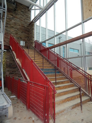
Generous spaces enabling plenty of flexibility, high ceilings, some bold color and an attractive, contemporary aesthetic are some of the first impressions made by the interior of the William F. Cooke Elementary School near Wilmington, Del. The K-5 building, under construction at this writing, is the latest project by the 16,000-student, 32-school Red Clay Consolidated School District.
School Planning & Management recently joined the district’s Ted Ammann, assistant superintendent; and Marcin Michalski, manager of Maintenance and Facilities, for a tour of the 70,500-squarefoot school, designed by Becker Morgan Group, which will have 30 classrooms and a capacity of 660 youngsters when it opens in August 2015. Workers were busy at the
evolving construction site.

PHOTOS COURTESY OF SCOTT BERMAN
A decade ago, there was “less focus on aesthetics and lighting” at Red Clay than there is today, Ammann explains, and that is just one of the shifts in how the district approaches renovated and new interior designs. It’s a priority that any interior space is flexible enough to accommodate flipped classroom situations and teaching technologies. That being said, interiors start at entrances, and inviting main lobbies and main halls are seen as the first chance to make positive impressions, says Michalski.
Looking deeper inside district schools, that idea is implemented in many ways, including:
- using VCT tile to replace aging carpet in classrooms and hallways, in a process that is still underway around the district;
- precluding any acoustics problems that result from removing carpet by adding some area rugs and installing a RedCat sound amplification system for teachers, who after an adjustment period, now like it;
- adding rich colors and decoration — “bright, exciting, inviting,” Ammann says — particularly in elementary schools; and
- providing more neutral tones for higher grade levels, but with a variety, and pops of school colors on lockers, door and window frames, in an array that a rotating paint cycle prevents from drifting.
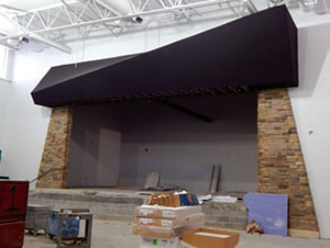
Various interior design strategies come into play at Cooke Elementary, which has features such as sinks in hallways just outside restrooms, which keeps restroom traffic moving; few built-in cabinets in classrooms, enabling teachers to arrange the interiors they want; a room for community functions with its entrance in the school’s vestibule; and inset ceiling LED lighting. There are distinctive touches as well, as in the use of interior stone and windows in a music room that invoke musical notes.
Ammann points out, by implication, the need to avoid over-guessing in terms of technological and other changes to come in the years ahead. After all, “you never know” precisely what changes may happen that will impact the interiors of schools. That being said, some things will remain, such as interiors that “need to be safe and conducive to learning,” he says.
Whatever form they take, changes are impacting school interiors. In fact, school design is in the midst of fundamental change, says Paul Hutton, principal of Cuningham Group Architecture. Active learning, or as he prefers, “next-generation learning,” is driving that change, in Hutton’s view. A double-stacked row, say, of traditional classrooms inhabited by one teacher and one class is giving way to learning suites and learning communities, spaces with flexible grouping and functions, and zones for lecture, individual study and collaborative activities.

PHOTOS COURTESY OF SCOTT BERMAN
Today’s open and flexible educational spaces, suited to accommodate a variety of uses, need not signal a return to 1970s’ open plans, which were often “limited by poor materials and bad acoustics,” says Hutton. And in his view, furniture is one of the key ways forward.
Hutton points out that furniture can help activate interiors, and learning, by being adaptable, such as tables that are easily nested together for collaboration and moved apart for individual study. In another point, learning with devices such as iPods and tablets are creating new postures, he argues, which calls for new furniture to match. And fidgety kids may be revealing active brains — in other words, avoid rigid seating and acknowledge that some kids prefer to stand and work, he says. He believes it’s worth it to consider all of the options, including dedicating a higher percentage of the budget for quality furniture that responds to such changes. According to Hutton, manufacturers are responding accordingly.
As that broad movement evolves, districts are working on a practical, everyday level to create interiors that respond to a variety of needs. And again, those needs are changing.
Randall Dobler, director of Facilities, Operations and School Safety at Southampton Public Schools on Long Island, has seen such changes, particularly in recent years as the district has substantially renovated its three schools. Dobler, with the district for 12 years and involved with school facilities work for more than two decades, notes a few that may ring a bell with facilities professionals. Those changes include using more and more bold colors and school logos; renovations spurred by security, such as vestibules; removing carpets from classrooms, in part stemming from the gathering attention to indoor air quality; and using polycarbonate partitions, automatic hand dryers and soap dispensers in restrooms.
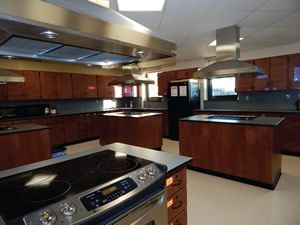
Dobler pointed out signs of such interior changes and others during a walk through of Southampton Intermediate School, renovated and expanded in a project designed by BBS Architects & Engineers. Among the interior standouts: a remodeled home economics suite with color-coordinated finishes, cabinetry and phenolic resin countertops by Campbell Rhea, with a classroom space also well equipped, this time with a Smartboard and sheer, light-diffusing rolling shades over generously sized windows.

PHOTOS COURTESY OF SCOTT BERMAN
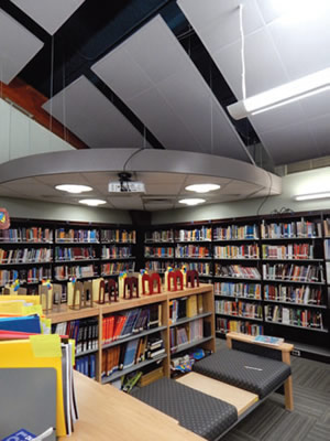
Elsewhere in the building, the interior of the school’s library is an attractive combination of lighting, well-appointed shelving and seating by Worden Library Furniture, and acoustically driven ceiling clouds — the panels replaced a spline ceiling tile system — and carpet tiles color coordinated with furniture.
According to Dobler, the district has renovated the cafeteria of another district building, the high school, in a project that included adding perimeter booths as well as tables with built-in stools. He says that project “made the cafeteria better aesthetically and at the same time, made it easier to clean — manpower is always a concern.” It is a pragmatic response to everyday needs that also balances aesthetics with ease of maintenance.
At Red Clay, Michalski takes a personal, as well as professional, interest in renovating interiors. “I grew up in this district,” he says, “and I want to make sure that when people see our schools, they want their kids to go here.” It seems not only a useful perspective to keep in mind for interiors today, but also a point of view likely to stay useful for years to come.
Some takeaways about interior designs of schools:
- Visit other districts when researching potential approaches, as did planners at the Red Clay district. Talk to administrators, of course, but also with teachers about how they and their students use spaces.
- Think through how interior design components impact each other. For example, taking carpets out of classrooms? Nip any acoustic problems in the bud with sound amplification systems for teachers, as well as ceiling and wall elements.
- Include the design team throughout the entire process — including the selection and procurement of furniture and furnishings, according to architect Paul Hutton. Interior design, furnishings and furniture need to complement and comport well with each other.
This article originally appeared in the issue of .