Finding New Life in an Old Space
- By Earl Crossland
- 01/01/16
PHOTOS COURTESY OF SCHOOL OUTFITTERS
The problem with the library at Sycamore High School, in Cincinnati, was simple: students just weren’t using it. The large space was full of potential, but completely outdated. Shelves were lined with old periodicals now accessed online, furniture was not conducive to learning styles and the room was dim and drab; students went to the library because they had to — not because they wanted to. Impractical furniture and decades-old décor needed to go, modern technology needed to be introduced and integrated, and the room needed to feel welcoming; it needed to be a place where students wanted to spend time.
Luckily, Doug Mader, Sycamore’s principal, expressed a very clear vision: he wanted a “Starbucks vibe” — a place where students would come in, hang out, stay and do work. The space was to be the hub of the school, full of activity before first bell and into after-school hours. At his former school, Mader had seen how changes can affect kids. He saw how it bound them as a community and made them feel special. As lead architect Brian Gilliland put it, “he does a lot to get the kids involved — to give them ownership.” And so the two worked closely together in a streamlined process, allowing them to adhere to a singular vision.
PHOTOS COURTESY OF SCHOOL OUTFITTERS
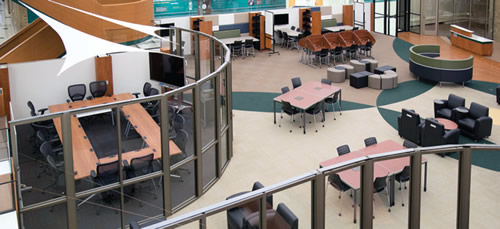
From the Bottom Up
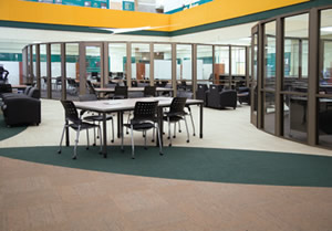
Seeing this vision realized required a complete overhaul: the room needed furniture that was functional and versatile — but comfortable, pleasing aesthetics, and the tools and technology required for 21stcentury learning. A natural starting point was the floor. Designer Brooke Jolitz saw the wide expanse as a blank canvas explaining, “The space is so large, it could take a lot of pattern and color. We wanted to use floor patterns to break up the space into different areas.” She took the opportunity to make the space both functional and aesthetically appropriate, dividing it into sections to be used for various purposes and incorporating swooping designs reminiscent of the school’s mascot — the Aviators. Viewing the floor from the lofted area above gives students and staff an appreciation of the cohesive design.
PHOTOS COURTESY OF SCHOOL OUTFITTERS
The effect was completed above: with a lofty space that brought floor and ceiling together, it made perfect sense to mirror the effect below up high. Fabric hanging from the lofts adds a striking visual interest, complements the floor and repeats the motif of flying and aviation.
Incorporating Functionality
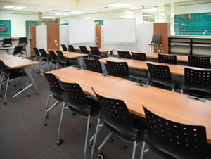
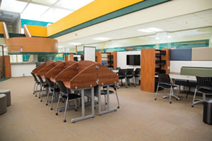
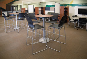
Having set the tone on top and bottom, it was time to fill in the middle. With unused books taking up most of the library’s shelving, there was an opportunity to reallocate space, making it completely usable. And, eliminating outdated, static and cumbersome elements worked naturally to freshen the atmosphere. The team brought in sleek-profile furniture that could be easily rearranged to accommodate various-sized groups, including tables and chairs, lounge seating, and carrels for those working quietly and individually. They also incorporated “Shapes” soft seating, which adds a stylistic flair while offering customizable versatility, and a “hive” statement piece — a large, circular unit that offers sofa-style seating along the inside, and higher, café-style seating around the outside. The room now also includes its own “Times Square” — two monitors hanging on a circular wall, perfect for accommodating large groups of people.
PHOTOS COURTESY OF SCHOOL OUTFITTERS
The team was also able to bring to life a stage area that had previously gone unused: a large resource desk that had been a barrier was removed, opening up the space for much easier interaction. There’s now room for chairs for an audience, and a raised platform perfect for a speaker or small performance. This redesign was beneficial in two ways, as the functionality of the old resource desk has been relegated to a small room behind the space; since checking out books is rare these days, there was not a reason to keep it in a high-traffic zone.
Additional opportunities for increased functionality were two rooms tucked into corners of the library. Previously dimly lit, unused spaces, they are now a conference room and additional classroom. Teachers in particular love these spaces; the conference room is bright and appropriately situated in a common area of the school, and the classroom features mobile, versatile furniture, perfect for a variety of lessons and activities.
Measuring Success
If seeing the new media center in use the way it was intended, the project was a huge success. It’s incredibly validating to go to the school and see the space buzzing with activity, exactly as the team pictured. The space is now comfortable and modern with more color, a contemporary feel, more flexibility and an incredible amount of functionality. The goal was to create a place students loved to be, and walking into the school and seeing it full of activity was exactly what we’d been hoping for.
PHOTOS COURTESY OF SCHOOL OUTFITTERS
This article originally appeared in the issue of .
About the Author
Earl Crossland is a partner at VSWC Architects in Mason, Ohio. VSWC is a full-service architecture firm, offering everything from site analysis and master planning to commissioning and record drawings — all while approaching every facet of your building with personal attention and exemplary service.