Schools Should be Fun Places
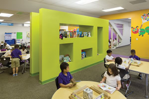
PHOTOS COURTESY OF LITTLE
We seem to have forgotten that schools have to be fun
places. Schools are supposed to inspire wonder, creativity
and innovation through the teaching and learning
of 21st century skills (see www.p21.org). They are supposed to be
welcoming environments that instill in us a love for learning, yet
all too often they are boring, gloomy, colorless, and sadly, at times,
dark, isolating and lifeless spaces.
The perceived realities of maintenance and cost have driven
school districts to a culture of homogeneous, ‘Parchment White’,
bland learning environments. In fact, it is sometimes hard to differentiate
between prisons and schools as the typology of Epoxypainted
CMU walls lining double-loaded corridors with obscure
rooms seems to work equally as well for correctional facilities
as it does for learning facilities in many counties. Our challenge
today is the world of education has completely changed and we are
hindered by a tremendously large stock of facilities that support an
industrial revolution learning model that does not meet today’s or
tomorrow’s educational needs.
As we prepare our students for the Innovation Economy where
entrepreneurship and a cross-collaborative culture prevail, it is
critical that our learning environments be places where students
can practice every-day learning for tomorrow. Whether renovating/adding onto an existing school or building a new ground-up facility,
there are three strategies that can be implemented to transform schools into environments for the future of
Learning: design, lighting and color.
Design
At Little, we are looking at a “Pattern
Language” for rethinking learning
environments and have identified eight
patterns that can support a culture of
sharing, collaboration, creativity and
innovation — the critical skills necessary
for tomorrow’s Innovation Economy. These
patterns include:
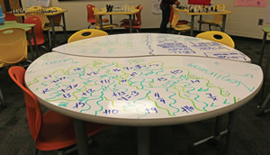
1. Sharing-scaping — Rethinking
every surface of the school as opportunities
to inquire, exhibit, present and share
ideas. Interpret the learning environment
as a crowd-sourcing “sketch-scape” and
implement design measures that promote
the idea that learning is everywhere.
PHOTOS COURTESY OF LITTLE
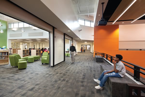
Transparency at McNair Middle School, Fulton County Schools.
2. Transparency and Connectivity —
This is the single most important pattern in
creating a school culture of openness, excitement,
belonging and accountability. Environments
that promote transparency and
connectivity allow the work of the students
to be on “display” and offer more exposure
to informal learning opportunities.
3. Creativity — Design learning
environments as a tinkering landscape
that supports the maker-generation and
project-based learning. These spaces
encourage manipulation of materials and
hands-on experiments that lead to more
engaged students.
4. Relevance — Create schools that
serve as a mechanism to “connect-thedots”.
This means designing an environment
that supports transdisciplinarity and
the making of T-shaped individuals who
have the ability to acquire in-depth understanding
of multiple topics.
PHOTOS COURTESY OF LITTLE
Sketch-table at McNair Middle School, Fulton County Schools.
5. Collaboration — Environments
that support a culture of collaboration is
empowering to both students and teachers.
Designing a space that can be configured
for teamwork and collaboration amongst
students prepares them for the real-world
environment.
6. Funscape — Create spaces for
out-of-the box thinking, unexpectedness,
wonder and, most of all, fun. These innovation
labs allow for authentic experiences
that lead to a passion for learning.
7. Flexibility and adaptability —
Design learning environments that have
the capability to change and adapt to future
needs. These environments also help provide
a landscape of learning spaces to support
personalization and differentiation.
8. Active and Engaging — Studies
show that students retain up to 80 percent
more information through active learning.
Designing this type of environment
includes the use of technology to support
(not drive) education, functional outdoor
classrooms and maker spaces.
PHOTOS COURTESY OF LITTLE
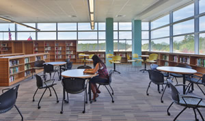
Daylighting at Apex Friendship High School.
Lighting
Research shows that students perform
better when exposed to natural light. In fact,
one study says that kids in school who are
exposed to natural daylight score 16 percent
higher on tests than those who don’t. Why?
Exposure to nature and natural daylight,
is good for our bodies as it lowers blood
pressure and the stress hormone cortisol. As
designers, we should open up the window
line, making sure we bounce light as deeply
into each and every one of the learning
environments. Unfortunately, even with this
design intent, many schools often decide
to close blinds to avoid glare or will avoid
incorporating additional windows in the
design to protect valuable wall space.
To address this challenge, we use daylighting
computer models to help determine
how to maximize natural daylight while
increasing wall space and reducing glare.
PHOTOS COURTESY OF LITTLE
McNair Middle School.
As seen on these images and diagrams
above, by elevating the windows in parts of
the room with light shelves while lowering
the sill to the floor in other parts, we have
arrived to a great combination that allows
visibility out, usability of walls up to 6 foot
8 inches from the floor, and daylight with
less glare and farther “throw” to the inside
of the room due to the fact that we bounce
part of that light back to the ceiling and it
indirectly reflects deep into the room.
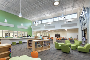
Color and Branding
The importance of color in our learning
environments should not be underestimated. The use of color has the potential to make
us perceive spaces in an entirely different
way. On the other hand, a lack of color can
make us feel bored and uninspired. Color
can be used to highlight areas and color
theory can be used to support appropriate
learning moods.
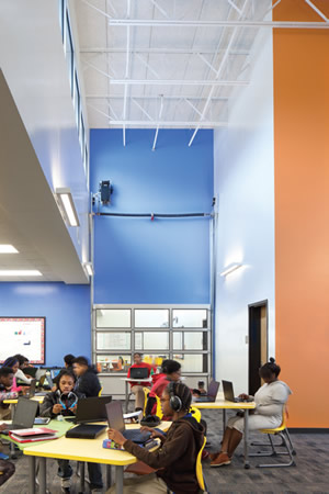
PHOTOS COURTESY OF LITTLE
Similarly, branding and graphics can
create transformative cultures in schools
and make environments feel less generic.
Graphics are critical to expressing who
you are; your culture, history, vision and
values. When done thoughtfully, they
create a more personalized experience to
inspire learning and innovation. By using
bold graphics and large fonts, we are able to
mentally and emotionally connect students
to a space while elevating the cool-factor of
our learning environments.
School should always be a bright spot
for our hearts, minds and our thinking.
Thoughtful design, along with the incorporation
of lighting and color, allow us to
rethink the vital role that space plays in
providing successful student experiences
for the next frontier of education.
This article originally appeared in the issue of .