Future Focused
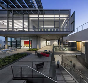
PHOTO © BILL TIMMERMAN
Forget four white walls and a chalkboard. Today’s cutting-edge
teaching styles demand innovative environments designed to
support collaboration, transparency and experiential learning.
College Planning & Management found a few examples of these
exciting spaces, from tricked-out classrooms to landmark
buildings, to get your innovative juices flowing.
LIFE SCIENCES BUILDING, LOYOLA MARYMOUNT UNIVERSITY
“Invigorating, lovely and wonderful,” is how James Simeo, Jr., AIA,
principal, CO Architects, describes Loyola Marymount University’s new,
award-wining Life Sciences Building in Los Angeles. The 100,000-squarefoot,
state-of-the-art facility allows for interdisciplinary collaboration
while putting the work of science on display for all to see.
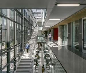
PHOTO © BILL TIMMERMAN
The old building divided disciplines — physics, biology, chemistry — by floor.
Corridors were narrow, stifling collaboration, and laboratory doors were
framed by slim sidelights, offering little transparency. “It was like a beehive
with everyone in their own cell,” Simeo recalls. “No one talked to one another.”
The new Life Sciences Building cracks that hive open. The school’s dean
mandated that the building destratify the departments, mix disciplines
and amp up the odds of a chance collaboration. Corridors were widened to
encourage mingling. Large glazed surfaces between the laboratories and
corridors replaced sidelights to increase visibility, allowing an easy view
of research and teaching activities.
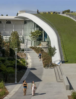
PHOTO © BILL TIMMERMAN
The floor-to-ceiling glass in a lab posed some unusual challenges. The
first is storage. Lab planners want all of the wall space they can get to hang
cabinets. Convincing them to buy into the window walls took a bit of work.
Simeo and his team also heard concerns that students would be too distracted
by the activity in the busy corridors. “We found out the students
concentrated more when they felt like eyes were on them,” Simeo says.
Instructors, for the most part, were on board with an interdisciplinary
approach. They were concerned, however, with how far their offices would
be from their labs. Simeo assured them that their space would be nearby.
The LEED Gold-certified building, with its green roof, 8,200 square feet
of photovoltaic panels and drought-tolerant landscape, works as a living
ecological lab. A large, standalone auditorium serves as a valuable campus
resource. “We always ask ‘how do we keep students in a building?’” says
Simeo. “The answer is make them so great that they don’t want to leave.
That’s what this building does. You feel so physically good inside the space.”
ACADEMIC INNOVATION CENTER, BRYANT UNIVERSITY
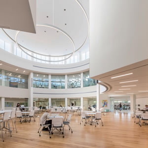
PHOTO © ANTON GRASSL/ESTO
As the Grand Prize winner of last year’s CP&M Education Design
Showcase, Bryant University’s Academic Innovation Center
in Smithfield, RI, is ground-breaking, forward-facing and evocative.
Its more than 48,000 square feet holds a variety of teaching
spaces calculated to accommodate multimodal presentations
and learning. There are breakout spaces to inspire design thinking
and creative problem solving, tiered classrooms to encourage debate
and critical thinking and flat-floored classrooms that support
different teaching styles while encouraging collaboration.
At the center sits the Innovation Forum, a highly flexible space
loaded with reconfigurable furniture and lots of whiteboards.
“It’s a space where students can fail fast and fail forward,”
explains Bryant President Ronald K. Machtley. That’s an important
lesson for students to absorb as they move from the structure
of academia to the fast-paced real world filled with disruption.
Machtley went so far as to choose hardwood floors over carpet to
mirror a rough-and-tumble start-up.
The building was completed in 16 months and came in $2.1 million
under budget, thanks to Machtley’s hands-on approach. He
scrubbed the numbers “hard” and insisted on completed drawings
before ground broke. “The design/build approach is a guarantee
for cost overruns,” he says.
Machtley shares some important lessons learned during the process:
don’t skimp on whiteboard materials, make sure desks are on
wheels and light enough to move around and buy comfortable chairs.
He also insisted on installing contemporary and traditional art.
Machtley asserts that the building is not to take the place of
content. Still, teachers who want to use this building must submit
a syllabus outlining how they will use the space. To assess its success,
the Academic Innovation Center will be graded on five innovative
competencies.
COLLABORATIVE CLASSROOMS, CALIFORNIA STATE UNIVERSITY, FRESNO
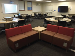
PHOTO COURTESY OF CSU, FRESNO
Cal State Fresno’s School of Education had a problem. They
needed to squeeze six more students into their computer
class, bumping the number from 24 to 30. Otto Benavides,
emeritus professor/director, had an idea. Knowing that the
existing room couldn’t support the extra bodies or technology,
he proposed something new; a student-centered classroom
that encouraged collaboration. The result was Cal State
Fresno’s first collaborative classroom.
That was in 2012. In 2014 Benavides added two more. Today,
those three spaces feature pods of desks, each with their
own interactive projector, power ports and screenshare software
so students can access and project their own content for
group work. Students can also annotate and edit work on the
projector and then save and email the results. The classrooms
also feature video cameras, green screens and cinema lights.
Faculty has reacted enthusiastically to the classrooms. “The
model we created has been replicated throughout the university,”
reports Benavides. Still, instructors needed training on how
to best use the space. As there is no front of the room, teacher
desks were replaced with a table on casters and outfitted with
a wireless keyboard that manages all of the technology.
Graduates of this school of education go off to create classrooms
of their own. Benavides reports that many of his students
have modeled the space for their K–12 students. “They leave here
knowing how to use technology to facilitate learning,” he says.
FLEX CLASSROOMS FOR COLLABORATION,
SALT LAKE CITY COMMUNITY COLLEGE
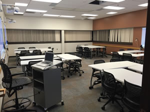
PHOTO COURTESY OF SALT LAKE CITY COMMUNITY COLLEGE
With 450 traditional, stand-and-deliver-style classrooms,
Utah’s Salt Lake City Community College didn’t have much space
for flexible, collaborative or flipped classroom learning. Until now.
Motivated by pressure from the School of Business, the school
now has 12 Flex Space classrooms that combine student-brought
devices, mobile furniture, updated cabling and power ports, and
interactive projectors. The result looks and works more like the
corporate world and supports a variety of teaching styles.
The rooms’ success has inspired other departments like
marketing, accounting, computer science and even the nursing
program to teach differently. To keep up with demand, the
school plans to have a total of 20 Flex Classrooms by September.
But not all of the instructors are ready for the change.
“As a community college, we have hundreds of adjunct professors
and they don’t have a lot of time to learn new technology,”
says Kurt Shirkey, assistant director of instructional technology
services. “Some of them still want blackboards and chalk!”
Shirkey insists that training teachers is imperative to getting
the most out of the classrooms. “I hate walking into the
space and seeing a PowerPoint presentation projected on
five screens,” he sighs. It certainly isn’t the best return on investment.
Shirkey estimates that Flex Classroom technology
costs about five times what he pays for standard classrooms.
“You should get 10 times the flexibility for that price.”
This article originally appeared in the issue of .