Elevate Classroom Environments, Create Positive Learning Outcomes with Color
By Kiersten Lent
Across the U.S., elementary- through high-school students spend around 1,195 hours a year within the walls of their schools. Like their curriculum, peers, educators, and families, a physical learning environment also plays a significant role in a student’s educational experience.
When it comes to student success, classroom environments make a difference. On average, schools in the U.S. are around 50 years old, making new construction and renovations necessary, according to the National Center for Education Statistics.
The design of a classroom could be attributed to a 25-percent impact, positive or negative, on a student’s progress over the course of an academic year. The visual environment of a student can impact their attention and learning, making a colorful environment a catalyst to making students feel welcome in the classroom. In fact, a 2022 Qualtrics survey of high-school students reports only 38 percent of students said their school was welcoming.
What’s more, a study by Campos and RAND Corporation in partnership with PPG found that painting classrooms with colors specifically intended to enhance learning can improve both students’ and teachers’ experiences in the classroom and increase their feelings of engagement in learning. Student engagement and their curiosity, interest in, and passion for learning has been linked to a variety of positive academic outcomes.
Color selection for classrooms must rely on evidence-based design and principles to enhance engagement and, more importantly, support both teachers and the students in the desired outcomes for their time within classrooms and learning spaces.
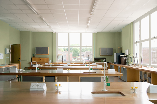
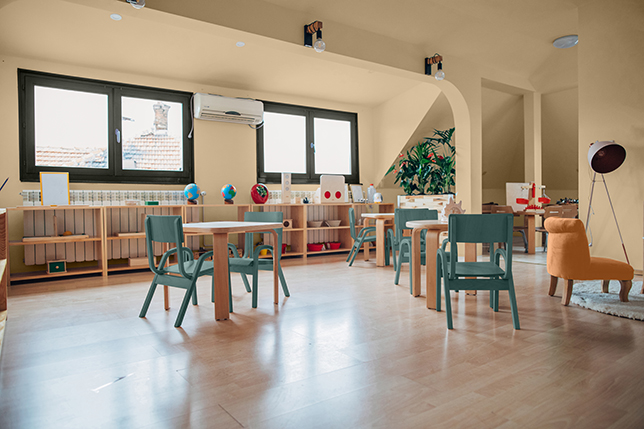
Images courtesy of PPG Paints
Color Selection for Educational Settings
Unlike a commercial or residential facility, selecting colors for educational spaces often begins with communication between school faculty and administration to understand the specific needs of the spaces within a school. Understanding the intentions for each classroom, hallway, or common space is crucial. It’s also important to understand factors specific to the school. For instance, a school’s budget often dictates the direction of a project. If the budget permits a school to be repainted only once every 10 years, paint colors and products that can stand the test of time are essential. Perhaps a particular classroom will be transitioned into a flexible learning space and another strictly used for computer-based learning. Each detail helps to set the direction for how a space will be used day in and day out and creates intention in the color selection process.
Weighing classroom usage, longevity and budget, it is essential to use color palettes that are flexible enough to shift without a substantial investment. Using a foundational base palette paired with colors specific to an age group or learning purpose will withstand a flux in trends and time periods.
The Role of Color Psychology in the Classroom
The classroom environment often has an influence on the behavior of children. Color is a powerful communicator and can be used to shape the way a classroom space is perceived or used. Impacting students and educators on many psychological and physiological levels, specific colors can enhance or impair learning, morale, and behaviors.
Studies have shown that color affects a student's attention span and perception of time. Visual stimulation makes stronger connections while fostering visual thinking, problem solving and creativity. Embracing the specific activities that take place in each space and selecting colors that align with the desired outcomes in the space leads to intentional classroom design, and in turn, can promote a sense of belonging.
In spaces where subjects like math, science, or project-based learning take place, colors can be used to create an engaging, interactive environment and sense of community where connectivity is encouraged. Blues and greens, especially lime-greens with yellow undertones—when used as an accent or feature wall—create a balance between energy and focus.
Alternatively, deeper colors such as dark blue-purples and burgundy promote relaxation and can be used to encourage introspective learning in spaces designed for reading or writing work.
Bolder shades create excitement in areas like a gymnasium. For example, shades of red can increase heart rate, speed, strength, and reaction time for high-activity spaces. Reds are also known to stimulate appetites and are commonly used in cafeterias.
Meanwhile, blues reduce heart rate and blood pressure, making them a common selection in places where softer colors can create a calm and soothing environment for studying and contemplating such as library spaces.
For lobbies or school entrances, oranges are proven to be welcoming to all, gender-neutral, and supportive to wayfinding when used in hallways.
Color Influences and Preferences: Color Across Various Age Groups
To elevate physical classroom environments, each paint or accent color selection must pair with specific learning objectives for the classroom while considering factors like students’ ages and local, cultural influences. It is important to consider not only how we want to design our environments and buildings, but also the age group of students, thinking and emotions we want to create based on the surroundings.
Just like experiences, conversations, and preferences are perceived differently at various ages, colors are also received differently at different ages. Infants are drawn to the contrast of black and white, preschoolers prefer primary colors, secondary and tertiary colors work well for grade-school aged children, pre-teens tend to like darker colors, and teenagers lean toward complex colors.
To select colors in an appropriate way for classrooms, age considerations can be used as an important tool to dial colors up and down in value, saturation, and placement based on the hopes of how students will react.
Preschool students
Playful and engaging colors resonate the most at this age. Use softer pastels to provide calmness and allow for quiet time, or saturated shades to spark imagination.
Elementary- and primary-school students
Inspiring creativity and promoting independence can be achieved using juicier colors with pop-art influences for a playful and fresh space. Meanwhile, colors that energize and stimulate enthusiastic young learners will help students who, at this age, are often faced with new educational and social challenges every day.
For this age group, finding balance between color that is engaging and tailored for younger students, but not overwhelming or overstimulating is necessary.
Middle- and high-school students
More mature, yet appealing, colors are preferred at this age. Select deeper, saturated hues balanced by brighter, unexpected contrasts that pull from the digital world of social media and online learning which this age group is accustomed to. Meanwhile, the use of grounded and refined colors feels refined, but they also don’t take themselves too seriously. Use these eye-catching pops of color paired with clean, lighter tones and warm neutrals.
Materials matter, especially with high-school students. Sophisticated finished woods and metals, influenced by trends in higher ed and hospitality, are appreciated at this age. Students will gravitate to refined palettes due to curated inspiration found in the social media and entertainment content they consume.
In today’s world, 11–18-year-olds have greater access to aesthetic inspiration than ever in the past. This wide scope of influences and micro trends allows for a greater exploration of style and personal expression, which shapes the desire to curate a unique and individual aesthetic.
The Benefits of Biophilic Design in Schools
In the words of architect Frank Lloyd Wright, “Study nature, love nature, stay close to nature. It will never fail you.”
Across all age groups, commonality can be found in biophilia, or design which brings natural elements indoors. Studies prove that access to nature and natural-feeling surroundings help foster creativity, alleviate stress, and increase positivity. Using biophilic colors, like warm neutrals and rich browns and greens, in a way that mimics natural landscapes and accenting with bright pops of color help to develop engaging educational spaces.
By incorporating nature-inspired hues, biophilic design provides several benefits to students’ well-being. From boosting creativity and cognition to improving overall emotional health, biophilia is shown to reduce stress and boredom, keep students engaged, and improve the academic success of students.
Incorporating Color Trends into Learning Spaces
Color trends continually evolve, and often for students, trends are impacted by external sources such as social media. The ease of instant connection allows students to expand their visual world to help inform the design directions they gravitate toward. Because of this, PPG color experts have found that children now appreciate more mature and sophisticated levels of design than believed in previous decades.
While bright colors are still integral to an educational environment, they are no longer used in rainbow palettes, but rather balanced by softer pastels and muted mid-tones. Richer tonal shades are also used to create a sense of atmosphere and gently ground a space.
Balancing color trends with the longevity of a space and other considerations like school or mascot colors must fit together like puzzle pieces. Start by selecting colors that match the needs of the space. In a library, for example, select a color that encourages focus, calmness and is grounding such as a saturated, muted blue or ocean-inspired green tone. Then, apply this color through the lens of recent color trends forecasts.
Color, Design Influences Impact Students’ Learning Experiences
Understanding of the positive impacts that color can have on a space, and its potential to impact moods and behavior, designers, educators and school administration must work closely to ignite the power of color and paint in spaces for students to learn, grow and thrive.
Color can be a powerful tool to spark engagement, creatively, inclusion and more. How is your school or learning environment leveraging the power of color?
Kiersten Lent, PPG color and design manager for educational facilities, has a BFA in textile design from the University of Georgia and draws from her fine arts background to share her love of color. She has worked in the commercial architecture sector since 2015.