University of Detroit Mercy Student Fitness Center
TMP Architecture, Inc.
Project of Distinction Winner 2014 Education Design Showcase
Project Fact Sheet
Facility Use: College/University 4-Year Institution
Project Type: New Construction
Category: Sports/Athletic Facilities/Fitness Centers
Location: Detroit, MI
District/Inst.: University of Detroit Mercy
Chief Administrator: Tammy Batcheller, Associate Vice President for Facilities Management
Completion Date: August 2012
Design Capacity: 1,377 students
Gross Area: 40,266 sq.ft.
Space per pupil: 29 sq.ft.
Site size: 1 acres
Cost per student: $5,193
Cost per sq.ft.: $178.00
Total project cost: $7,948,640
Building construction cost: $6,937,620
Site development cost: $49,730
Furniture & equipment cost: $192,000
Fees and other: $600,347
Quick Tour:
 Size: 40,266 Square Feet
Total Project Cost: 6,937,616
Opening:
Fall 2012
Amenities:
- Two basketball courts
- Group Exercise room
- 3-Lane Running Track
- Free-Weight Training Area
- Fitness Area with a Variety of Machines
- Open Floor Fitness Area
- Day Lockers
- Men’s Locker Room
- Women’s Locker Room
- Snack Bar
- Lobby / Lounge with Seating
- Outdoor Seating Area
Special Challenges & Solutions
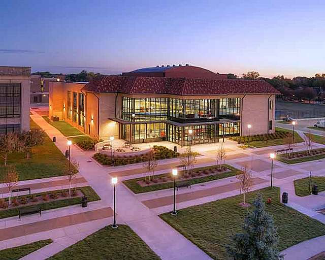
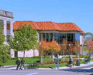
Designers faced challenges to maintain the 1920s style of the surrounding campus architecture with an extremely limited budget, as well as an accelerated schedule.
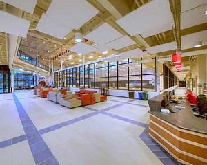
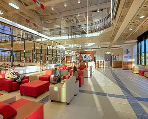
The fitness center is the first new building constructed on the University of Detroit Mercy campus in over 40 years and is an exciting destination for students and staff. A two-story lounge area with views to all major activity spaces provides a congregation point for students to hang out, socialize and study.
A large weight fitness area overlooks the historic campus. Large picture windows provide welcome natural light and allow views inside and outside, connecting the new building visually to the campus.
Cost Effectiveness
 At $167 per square foot, the University truly received a lot of “bang for their buck.” This was achieved without programmatic or functional compromises. Instead, cost savings were realized by keeping the geometry and structure of the building simple, thereby allowing more available funds for materials and finishes such as clay roof tiles, porcelain floor tile and a generous use of glass. Quality materials were used to emulate the mission style architecture of the original campus buildings. Creative resource management and a strong focus on the goals and priorities of the University contributed to this result. A less formal vernacular for the interior was more economical to build and contributes to a more playful and upbeat recreational atmosphere.
Operational efficiencies were essential to adhere to a lean business plan. A resulting design solution was clear circulation and transparency, minimizing the number of personnel required to safely operate the facility.
Goals & Visions
The new University President was particularly interested in developing the idea of a “live-learn community.” He felt that the campus lacked spaces that encouraged socialization and a blend of students studying various disciplines. The rarely visited Student Center – an older facility with few areas for students to relax and hang out – was not serving this need. Students seemed isolated within their majors, and rarely spent time with other students and faculty members outside of those educational zones.
Prior to the new facility the University did not have a student fitness center, but rather a small area with weight equipment in the student center’s lower level. The area was similar in size to a small hotel fitness center.
The new center is now the University’s social hub – with a beautiful gathering space in the facility’s lobby serving as a “live-learn” oasis. The centrally located center allows students and staff to congregate and encourages important teachable moments to occur outside of the classroom.
Students seek out the facility because of its comfortable atmosphere and welcoming spirit. An outdoor plaza provides another usable space where students can enjoy a snack from Tommy’s – the lobby café which features smoothies, granola bars and other healthy options, as they take advantage of the facility’s Wi-Fi and other amenities.
 Planning Process
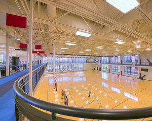
Initially, TMP designers, along with University representatives from the Facilities Department, Student Recreation and Athletic Departments, discussed functional goals and proceeded with a programming process. With an original building footprint concept that exceeded the University’s means, architects suggested a phased approach to the project. With an ideal location on the campus mall, the building would maintain a classic form, and was planned to be stacked with a two-court gymnasium and elevated track. The track was designed to “poke through” above the lobby area to provide a more useful, valuable and larger overall running area.
After many programming meetings, TMP designers created a three-dimensional representation of the proposed facility, including footprint studies and conceptual plans. This early study resulted in renderings for fundraising purposes. TMP produced graphic material that was used to define the building and to explain its value to the University community, represented in brochures and on display boards during donor events. The initial ‘sketch’ won donor approval, which translated into a clear direction for the future design. It was agreed that the building would look similar to original 1920s campus buildings – which included clay tile roof materials, stone cladding and overall classical proportions. The challenge for designers was to “sympathize” with this campus style yet include elements to announce to students that this was a fitness center and a “place to be.”
The idea of a second phase for the pool/natatorium was proposed with a separate entrance for competitive contests. A recreation component of the pool would be accessible from the fitness center. The Phase II wall for the future pool addition was designed as structurally independent. Lintels were carefully placed to allow for larger openings to be constructed in anticipation of the pool addition.
Existing campus electrical and mechanical central utilities were extended to provide electrical, telecommunications, and cooling services to the new building. Utility services were also designed to accommodate the Phase II pool addition, and system components were designed and installed to provide minimal interruption to the Phase I spaces, allowing the building to remain open for student use during future Phase II construction.
Unique Features/Innovations
The transparency of the new center opens and extends visually to the campus mall, and takes advantage of unique geometries and siting of the new building. The new center is truly a focal point on campus, inviting students, staff and faculty members inside.
The facility is air-conditioned unlike many of the older campus buildings, which makes it an attractive place to hang out. The two-court gym represents one of the largest enclosed open spaces on campus, allowing for assembly. The President’s Gala, typically held at an off-site rented facility, took place on campus for the first time in many years at the Fitness Center in 2013. Beyond its recreational value, flexibility of the space has allowed hosting of campus movie nights and the faculty/staff Christmas party.
Safety & Security
Surveillance cameras work well, but more effective security results from vigilant, aware staff members. The openness of this facility allows minimal staff the ability to see and hear if something is amiss. Similar to keeping a home’s blinds open when no one is at home, the facility’s simple design and glassy façade allows for easy supervision of the facility itself as well as the goings-on outside the entry and between buildings.
Environmental Considerations
 There is compactness to the new center’s form – with stacked gymnasium and track elements. The expansive use of glass makes the facility less reliant on light fixtures and provides natural light. A recycled rubber track and responsibly harvested wood accents at the reception desk perpetuate the facility’s sustainable characteristics.
Materials
The design of the fitness center relates to the mission style of the original buildings on the campus, with origins back to 1877. The University felt strongly that the facility should recall these architectural roots. Materials and colors were selected to be sympathetic with this style; however, large glass areas were also incorporated to allow welcoming views inside and out. The interior expression is very open and airy, creating an exciting and efficient environment. Students using the facility are visible to passersby, offering a living “advertisement” for the facility and its offerings.
Concrete masonry units similar to stone but more economical were used on the exterior to relate to the surrounding Spanish-style buildings. On the inside, time-tested materials and systems that would withstand the use and abuse of this type of facility were incorporated. The materials within are easy to maintain without the use of harsh chemicals. Durable porcelain tiles in the lobby offer texture and present the school’s color scheme. The University wanted the materials to present a sense of timelessness so they would not need to be re-styled anytime soon.
Opening Day
The realization of the new fitness center was the culmination of several years of fundraising prior to actual construction. The final result represents a “dream” for many students and University personnel. Since its opening, the facility has been very popular with students and is heavily scheduled for both fitness programs and social events.
Project Description:
1) Control of Institution: Private: Not for Profit
Locale:
Urban
Methodology & Standards:
First-Cost; State Mandated Standards
Funding Method(s):
Primary Source: Primary Source: Private Funding
Project Delivery Method(s):
Design-Bid-Build
Sustainable/Green Design:
Principles Followed: LEED
Energy Efficiency and Conservation: Energy Efficiency; Building Automation/Energy Management Systems
Indoor Environmental Quality: Electric Lighting Systems/Controls
Architect(s):
TMP Architecture, Inc.
David Larson, AIA
1191 West Square Lake Road
Bloomfield Hills, MI 48302
(248) 338-4561
[email protected]
http://www.tmp-architecture.com
Associated Firms and Consultants:
Interior Design: TMP Architecture, Inc.
Landscape Architecture: Michael J. Dul
General Contractor: The Monahan Company
Structural Engineer: Structural Design Inc.
Electrical Engineer: Peter Basso Associates
Mechanical Engineer: Peter Basso Associates
Civil Engineer: Professional Egineering Associates
Other: Jenosky Consulting, Inc. (Door Hardware Consultant)