Coloring the Classroom
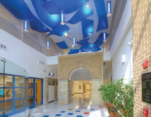
PHOTO COURTESY OF TMP ARCHITECTURE, INC.
As schools are being built or remodeled, there are literally thousands of issues to be addressed. Unfortunately, color, especially the color of classroom walls, is often overlooked.
“For budget reasons, a lot of schools don’t seek out good information on color,” says Bonnie Krims, IACC, architectural color consultant with Bonnie Krims Color Studio in Concord, Mass. “In a lot of cases, color choices are left up to administrators, teachers or the maintenance departments. As a result, a lot of walls just end up white, which can lead to understimulation.” Another problem, according to Krims, is that, in the past, there was a belief that the more colorful the school was, the better it would be for the kids. However, recent research says that isn’t necessarily the case. In many cases, too much color, or colors that are too bright, can lead to overstimulation. “The goal is to find a balance,” she says.
According to the International Association of Color Consultants - North America (IACC-NA), a school’s physical environment has a powerful psycho-physiological impact on its students. “Appropriate color design is important in protecting eyesight, in creating surroundings that are conducive to studying, and in promoting physical and mental health.” The IACC also notes that many cases of irritability, premature fatigue, lack of interest and behavioral problems can be attributed directly to incorrect environmental conditions involving poorly planned color and lighting.
While color selection is important, in that certain colors have certain effects, there is still some flexibility, according to Jill Pilaroscia, IACC, principal with Colour Studio, Inc., in San Francisco. “When you apply color, there is no magic formula or no single best way to do it,” she says. “Part of what will influence selection can be the geographic location of the school, the quality and character of life in the school, and the cultural background of the students.” However, she adds, there are some basics to consider, based on color psychology, visual ergonomics and biological response to colors.
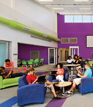
PHOTO COURTESY OF FANNING HOWEY AND EMC2 GROUP ARCHITECTS PLANNERS
Colors in elementary, middle and junior high schools
According to Pilaroscia, younger children tend to be more active, so you can use a brighter color scheme and warm colors, such as warm yellows, pale yellows and so on. “One problem is that a lot of teachers hang so many things on the walls that classrooms can become complete visual chaos,” she says. It is important to try to have an orderly and organized room, to reduce the amount of nervousness and anxiety in the students.
Amy Wax, IACC, owner of Your Color Source Studios, Inc. in Montclair, N.J., agreed. “In most classrooms, there are a lot of other things competing with wall colors, such as posters, artwork, etc.,” she says. “These can lead to overstimulation, which is one reason you don’t want the wall color itself to be too stimulating.”
With younger children, according to Wax, the goal is to achieve balance with colors, which means some, but not too much, stimulation. She recommends warm colors that invite students in and make them feel the classroom is a warm environment, so they enjoy being there. “Generally, younger children prefer primary colors — yellow, red and blue,” she says. “However, if a color is too strong or bright, it becomes too stimulating, which causes some children to become overstimulated, energetic or anxious.”
For these reasons, again, Wax recommends warmer primary colors. For example, instead of bright yellow, you can consider a creamy yellow, which is warm and draws on a primary color, but is not overstimulating. “However, if you use too simple of a color, such as a beige, it can be understimulating,” she says.
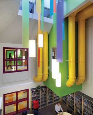
PHOTOS COURTESY OF HMFH ARCHITECTS, INC.
Another benefit of color is the ability to create focus. “You want to draw students’ attention to the front of the room, so maybe the wall where the teacher is located could be a brighter color, such as a yellow or a red,” she says.
Colors can be chosen based on even more selective criteria — the age ranges of the students. According to Krims, students ages five through eight in particular need to feel a sense of security in the school — that the school cares about them and that there is a positive social climate. Appropriate colors here are red, peach/orange, warm yellow, salmon, coral and violet. “These are warm, bright colors that reduce tension, nervousness and anxiety,” she says. “Walls can be painted a pale orange or citrus, for example, and red and violet make good accent colors.” If the ceiling is going to be painted, it can be painted yellow to represent sunlight. In any and all cases, according to Krims, black, white, gray or brown are not good choices for these classrooms.
As kids get a bit older, nine and 10, reds and oranges still work, according to Krims, but there are also some preferences for blue and green. Here, walls could be pale orange or citrus, and accents could be blues and greens, or maybe a red.
As students get still older, 11 or 12, there should be a transition from warmer colors to cooler colors. “Greens seem to become more popular,” says Krims. “Red tends to ‘go out the window,’ and there is less interest in orange. For these reasons, walls could be green, but with orange accents.”
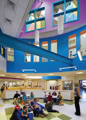
PHOTOS COURTESY OF HMFH ARCHITECTS, INC.
Colors in high schools
By the time students become teenagers, green is still popular, according to Krims, and there is a growing preference for blue. However, there is still some interest in orange accents. Blues and greens seem to enhance the ability to concentrate. She suggests that walls can be painted light green or blue/green.
“In high school, you want softer colors,” says Pilaroscia. “You want students to be able to concentrate more and be more introverted in their studies.” For this reason, she recommends beige, buff, pale greens, or pale blue-green, which help with concentration.
In addition, it is not necessary to paint all four walls in a classroom the same color. “You can do a focal wall or accent at the front of the classroom to relax students’ eyes, such as a blue-green or nature green,” says Pilaroscia. “Side walls can be softer and more neutral, such as buff.”
According to Wax, older students don’t respond well to primary colors, because they feel that the colors are too “young” for them. “They are more in tune with colors that are tied into the fashion world, such as teal or orange,” she says. “These more popular colors help make the students feel they are in environments that are more up to date.”
Wax agrees with Pilaroscia that is not necessary to paint all four walls the same color. “For example, if a room has four orange walls, it is likely to be overstimulating,” says Wax. She recommends instead maybe an orange on one wall and teal on the others. “You want a stimulating environment, but not one that is so overstimulating that it becomes distracting,” she says.
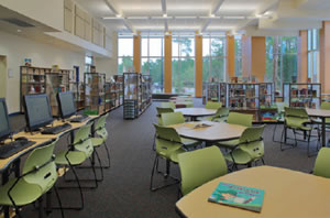
PHOTO COURTESY OF SCHENKELSHULTZ ARCHITECTURE
Gray Area. Experts say there is no magic formula or single best way to determine which colors will be most beneficial in the various learning environments. But there are some basics to consider, based on color psychology, visual ergonomics and biological response to colors. It is important that colors are chosen based on the age ranges of the students.
Additional considerations and options
Are certain colors better for certain subjects? Here, the research is less consistent. “Some research suggests that science classrooms are enhanced by a blue pallete,” says Pilaroscia. “However, it depends on the location of the school. For example, if the school is in a cold environment, you may not want the focal color to be a cool blue.” There is also some research suggesting that yellow is good for math classrooms. “However, not everyone agrees on these research results,” she says.
According to Wax, color can also be used as a navigational tool to create a sense of identity in certain parts of the school. “For example, science classrooms and hallways can be painted one color, music and art classrooms and hallways can be painted another color, and so on,” she says. “This can create a sense of community for the students.”
And don’t forget some of the other rooms. For example, Pilaroscia suggests that the nurse’s office and principal’s office be painted in more refined colors to reduce anxiety. “You don’t want a bright yellow or red in a nurse’s or principal’s office,” she says. According to Krims, pale or light green tends to be very effective in libraries, because it is a passive color that encourages quietness and concentration.
While there are, or should be, certain constraints in selecting colors for the various rooms in a school, the corridors are another matter completely. “It is OK to have more bright and animated colors in corridors, since the purpose there is to encourage people to move from one place to another,” says Pilaroscia.
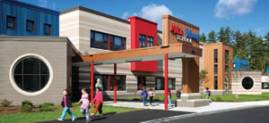
PHOTO COURTESY OF HMFH ARCHITECTS, INC.
Color My World. Part of what should influence color selections, whether interior or exterior should be the geographic location of the school, the quality and character of life in the school and the cultural backgrounds of the students. Designers also need to take into consideration the architecture and feel of the surrounding neighborhood.
“Colors can create a sense of identify for students,” says Debra Wilde, IACC, founder of Debra Wilde Design in Portland, Ore. Certainly, you don’t want to ask student opinions for colors in classrooms, where research has shown that certain colors are better for interaction and learning. “However, you can conduct a survey and ask students for suggestions on colors in other parts of the school, such as corridors, cafeterias, and recreation areas,” she says.
A final thought: According to Wilde, the consensus of the studies that have been done is that, overall, softer tones of primary and secondary colors, such as yellow, blue, red, green and orange, tend to be preferred in schools. “In general, though, students don’t react as well to tertiary colors or neutral tones,” she says.
This article originally appeared in the School Planning & Management December 2013 issue of Spaces4Learning.