New Look, New Logic

PHOTOS COURTESY OF MOSER PILON NELSON ARCHITECTS
On so many college campuses, the evidence of athletic facility construction piecemealed over a span of decades is there for everyone to see. These periodic additions were typically intended for one sport apiece and (prior to 1970) one gender, leaving institutions scrambling from the 1980s onward to accommodate an expanded roster of sports programs, women’s teams and recreational users. In their haste to meet demand, many athletic programs left old facilities underutilized as newer ones were constructed, sometimes right next door or even appended to the older structures.
The resulting assortment of buildings and building wings is both a curse and — given the right plan, owner input, design architect and budget — a blessing. More often than not, adaptive reuse of such spaces is simply the most logical and cost-effective route to a state-of-the-art facility.
Conquering Sprawl
The athletics program at the University of Rhode Island (URI) has the kind of facilities history that should seem familiar. It began with a 1940s-era federal armory, Keaney Gymnasium, which was donated to the university in 1953 with the stipulation that a military science and leadership (Army ROTC) curriculum continue to be offered and the program housed there. Tootell Physical Education Center was appended to the north end of Keaney in the late 1960s — primarily an aquatics center, bookended by two gymnasiums that served as practice space for basketball and volleyball, and including two weight rooms as well. Mackal Field House, comprising a 200-meter track, four basketball courts and a fitness center, opened in 1991, appended to Keaney’s south end. Featuring translucent wall panels and skylights, Mackal Fieldhouse was the first campus athletics building to feature ample natural light.
In 2002, the 7,657-seat Thomas M. Ryan Center — a multipurpose arena built to serve as the new home court for men’s and women’s basketball — was appended to Tootell’s north end. For all the pomp and circumstance accompanying the Ryan Center’s opening, the new facility left the athletic department with a lot of redundant space — particularly gym space — inside the four connected buildings. The women’s volleyball team continued to play and practice in Keaney Gymnasium, and the basketball teams utilized the Ryan Center and one of Tootell’s auxiliary gyms for practice, but seldom both Tootell gyms. The Field House was already available for recreational play. At the same time, there were separate, small spaces but not one central location for strength and conditioning. There was little coherence to this sprawling complex and, making matters worse, recruits wowed by the Ryan Center or student-athletes on their way to department offices or the trainers’ suite would become increasingly underwhelmed as they traveled back in time to 1968 and 1940 through dark, narrow corridors.

PHOTOS COURTESY OF MOSER PILON NELSON ARCHITECTS
It did not take long after the Ryan Center was completed for sports administrators to begin agitating for a new building wing that would solve some of their logistical issues — multiple undersized workout spaces, limited space for athletic trainers — and add some desired athletic and academic program space. Initially, the suggested site for the addition was a natural courtyard created by the Tootell addition to Keaney Gym, but budgetary issues shelved any such plans. Lack of funds and the great need for building improvements elsewhere on campus led university leadership to suggest that the athletic department “look introspectively,” as Art Tuveson, URI’s assistant director of athletic facilities, puts it, “and identify spaces that could be used better.” It was a suggestion heeded by the athletic department, and in particular the facilities and human performance departments (“We had a lot of time to think about it, because we were fighting for the dollars,” Tuveson says.).
Extreme Makeover
The resulting student-athlete development center — what is now called the Ryan Family Student-Athlete Complex — was a complete makeover that was part reorganization, part renovation and part rebranding. Designed by Moser Pilon Nelson, the project created so much positive change for such a relatively low cost that it serves to illustrate the five “musts” of any successful renovation project:
1. Determine a logical sequence of movement between spaces. Although you might think design would typically proceed from the proposed facility’s marquee spaces to the circulation around them, the fact is that, by definition, reorganization requires that even more thought is given to the building’s unifying element of circulation zones. URI was particularly blessed in this regard. Its primary assets were two large-volume spaces (Tootell’s practice gyms), one of which was located along an existing 300-foot-long corridor that linked the Ryan Center on the north and Keaney Gymnasium on the south. The same hallway passed by a smaller volume that had accommodated strength and conditioning, as well as an undersized sports medicine suite. The decision was thus made to upgrade the existing corridor, and to focus on the conversion of the gymnasium and ancillary spaces located along that axis.
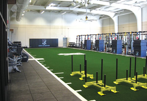
2. Use what you have. Transformation of a practice gym into an athletic performance area could have stopped with the installation of new flooring to go underneath weight and cardiovascular equipment and a synthetic turf surface for warming up, sled pulls and stretching. But you don’t go into these types of projects without giving some thought to creating a new aesthetic for the space. Because the gym jutted out from the north-south axis, this offered an opportunity to take advantage of the room’s would-be southern exposure by cutting away of the gym’s southeast corner and inserting floor-to-ceiling glass that completely alters the feel of the space. A 34-foot-long automatic shade helps mitigate morning glare, but during most hours of the day the room is now flooded with natural light, aided by skylights inserted into the openings where eight rooftop mechanical units had been.

PHOTOS COURTESY OF MOSER PILON NELSON ARCHITECTS
This tripling of strength and conditioning space created new adjacencies that allowed for the repurposing of space to accommodate a new cognitive cave for sport psychology assessments and concussion testing, as well as offices for strength and conditioning staff.
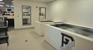
3. Understand how each space will be utilized. Each space that is to be remade must have its own internal logic. What is now URI’s sports medicine suite started as physical education administrative offices and a computer classroom, and designers and administrators made the connection between the new space and the school’s athletic fields by opening up the space with daylighting and a glass door that leads to a walkway connecting the two. Creating this direct path for injured athletes to access taping and training tables, or for ice to be loaded and transported to fields, became the central idea from which everything else (hydrotherapy tanks, rehab equipment) followed.
4. Be flexible on the project scope. One of the dangers in any renovation job is project creep — the possibility that fixing one building zone will necessitate further renovations elsewhere. This occurred at URI during the creation of an academic advising wing down a perpendicular hallway just inside Keaney Gym. The addition of air conditioning in all renovated spaces required that antiquated steam piping in Keaney be replaced, expanding the renovation to move beyond the first-floor classrooms, offices and meeting spaces to encompass the second- and third-floor football and soccer administrative offices. The result was a more consistent upgrade that will aid all varsity sports in studentathlete recruitment.
5. Spend money where it will do the most good. In the old Tootell building, it was possible to walk down its long central corridor and never realize that you were passing a gymnasium or other activity spaces. While the plan was to rebrand the circulation zone, designers took care to budget wisely, spending the most money at the places of greatest impact. The largest share created a Hall of Fame centered in the building lobby, which received costeffective treatments such as large displays on raised panels, and supergraphics that extend into the building circulation.
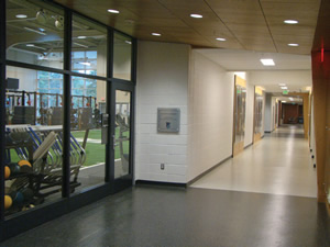
6. To call attention to the building’s new centerpiece, the strength and conditioning center, the two points of access into the space were judiciously opened up with floor-to-ceiling glass and glass doors, borrowing light from the space into the corridor, which was given a grander treatment — dark-colored flooring and sloped wedges of wood paneling to subtly direct attention toward the room’s interior. This is a conscious attempt to create a consistent theme, linking these look-ins to the new dark-tile flooring and wayfinding kiosk in the entry, which is topped with a sloped wedge made of metal.
More for Less
As much fun as it can be to spend money, it is even more satisfying as designers to take a space that no longer meets the standards of a modern athletic department and improve on everything from its look to its logic. As the owner of an older, gradually improving facility and the holder of the purse strings, it’s important to realize you don’t need to throw a lot of money at a persistent problem to make it go away. Clear thinking, clear-eyed user input and targeted spending are the keys to reorganizing and revamping athletic facilities for the primary purpose of student-athlete recruitment.
This article originally appeared in the issue of .