The University Store on Fifth
- By Suzan Lami, Jesse Gidley
- 06/01/15

PHOTOS © JIM SCHAFER
When the University of Pittsburgh implemented a major renovation of its campus bookstore, one of the most telling changes was updating the name of the store from The Book Center to The University Store on Fifth.
The new name is reflective of the changes in college bookstores. According to Eli Shorak, associate vice chancellor, University of Pittsburgh, “We can no longer be just a place where you come for books, supplies or clothing. We have to be relevant and provide services and an atmosphere that makes us a lifestyle store — a destination.” Shorak partnered with Jinx Walton, the University of Pittsburgh CIO, to have the university’s central IT division host a walk-in technology services desk as part of that destination appeal.
It was also important for the University of Pittsburgh to remain an independent bookstore at a time when many colleges and universities are outsourcing the operation of their stores.
“To be a resource for students, faculty and the community, we need to maintain control over the services and products we provide, and not be driven strictly by profit,” explains Shorak.
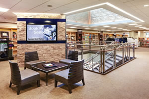
Shorak and the store director, Debra Fyock, conducted formal surveys with staff, students and faculty to determine what was “relevant,” and what resources would be valuable. The result is a flagship store with updated amenities including a café, a Technology Center that sells and services leading products, a featured area for books of local interest, engraving and embroidery services, an Espresso book machine that prints and binds books, and a recently acquired 3D printer.
To transform the space into a lifestyle store and destination, the University of Pittsburgh engaged Lami Grubb Architects, LP, who had successfully designed and built two other stores on campus.

PHOTOS © JIM SCHAFER
Creating an Experience
The two-story, 24,000-square-foot store is housed beneath a high-rise residence hall in an urban center. Significant challenges of the project included low headroom; an awkward “U”-shaped footprint with narrow passageways; very tight column bay dimensions; and a dark, outdated and poorly organized space with limited retail opportunities.
To overcome the challenges and create a positive retail experience, the flow of the space was reworked to focus on the shopper’s experience. “We understand that the success of a store is the experience that you give a person,” acknowledges Suzan Lami, principal at Lami Grubb.
“Stores always have a circulation path,” continues Lami. “We designed a more subtle flow because we wanted to create an enticing experience. Yes, you go in to buy Post-it notes, but end up experiencing all of the other departments — grabbing a cup of coffee and buying ear buds.”
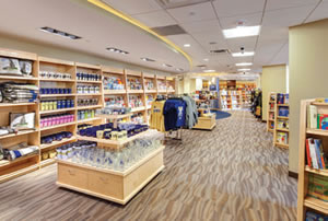
Lami and Jesse Gidley, project architect, carefully planned focal points and strong circulation cues to draw shoppers through the space — providing different experiences in the 10 departments. The reworked flow also created three entrances to the store — two entrances on the student quad for students and a major entry on Fifth Avenue to draw in the public.
“The focus and flow from the main entrance is very community-oriented,” explains Fyock. “As part of a vital community, we recognize that we are one of the few remaining bookstores in the city. In addition to textbooks, we sell general books.” And while the University of Pittsburgh’s blue and gold colors are subtly referenced throughout the store, the overall décor is neutral in order to encourage the non-university shoppers to feel welcome.
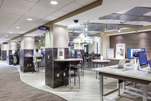
Fyock describes the entrance in the student quad as “more student-oriented” and says that the “middle door — also accessible from the quad — gets you right into the Technology Center, with the café and the information desk. All roads lead to the technology section in the middle of the store.”

PHOTOS © JIM SCHAFER
Open Space With Natural Light
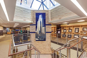
To create a brighter and more open feel, Gidley describes what was designed as “the big wow factor” — an open stairwell in the center of the store, capped by a large, central skylight and accented by a wall-sculpture of the university’s iconic Cathedral of Learning. The space, which includes a new elevator tower, works as a focal point to draw shoppers to the middle of the store and down to the textbook section in the lower level.
“The grand staircase and the skylight [are] important as a central destination and for bringing natural light into the store,” says Shorak. “It was key to getting the flow between the two floors to work well.”
The lighting was designed to draw customers through the store; pendant clusters highlight merchandise niches, curved bulkheads conceal rope light, giving the illusion of higher ceilings; and recessed cove lighting was used in certain areas to graze textured surfaces and accentuate their profiles, creating visual interest.
The store is visually very appealing, but there is a lot that can’t be seen. All new HVAC, lighting, data and sprinkler lines were incorporated — and hidden — in very limited ceiling space. “The beauty is that no one notices,” says Lami.
Flexibility and Innovation
According to Fyock, a key goal of the renovation was for the store to be very “current.” This requires the flexibility to be able to adapt to a wide variety of events, to changes within retail and within the college industry specifically, and to “grow things that are growing and reduce things are not as relevant.”

PHOTOS © JIM SCHAFER
To assure flexibility, nothing in the store is tied in — all fixtures can be moved to control the space. This allows Fyock to make room for 100 seats for an author lecture in the retail section, to move the textbooks in the lower level and create a training center, or to quickly set up special displays.
The operation of the store is now more flexible as well. Fyock can control the lighting and doors to focus on an event in the middle of the store, or have the door to the café and tech center open 24 hours during finals.
Another key goal of the renovation was for the store to be innovative.
“If you think about the lifestyle of students, faculty and staff, technology is important in every phase of their lives,” notes Fyock. “Part of our mission is to provide the support that helps students and faculty be successful, so we had to include the products and services they demand.”
A consumer-friendly Technology Center was designed with leading products from Apple and Dell, charging stations, a service desk and standup stations where certified staff can conduct demos and training.
A Popular Destination
The renovated store opened in the fall of 2013. Now, 18 months later, Fyock reports that “there has been more traffic and more sales in all areas.”
“The success of the Technology Center is beyond anything we anticipated,” she adds. “The number of faculty and staff visiting this department is tenfold. An amazing amount of people come in and we keep sourcing and buying more and more.”
As evidence of the student’s appreciation for the innovative approach to creating a destination store, CIO Walton points out that student use of in-person technology support increased almost 200 perecent when the technology services desk opened at The University Store.
This article originally appeared in the issue of .