Give Me A Sign

PHOTO © ANSEL OLSON
Signs and graphics are signs of the times. Times are changing, and so too are signage materials, manufacturing, and, on a very different front, ideas about how signs and graphics can advance a school’s educational mission.
With those changes comes a constant, continuing focus on quality in terms of visual aesthetics, durability and signage hardware and software. Two active members of the United States Sign Council, Max Aronow of SMI Sign Systems, and Rick Crawford of Mercer Sign Consultants, recently shared some insights about signage being used in schools today, while Brittney Butler, director of Environmental Graphics & Branding for VMDO Architects, offered ideas about an emerging graphics movement in schools.
Aronow, whose company often works with architects, describes a set of factors which many school facilities managers are familiar: building identity signs for school façades in the form of raised, or tactile, letters cast out of bronze or aluminum, or waterjet-cut and mounted plate brass, bronze or aluminum. That traditional approach can be “incredibly durable” material-wise, Aronow says, and having a brush finish to such lettering — in his experience, the most popular choice today being brushed bronze or brass — creates a look that looks fresh for a long time.

PHOTO © ALAN KARCHMER
Crawford has seen plenty of changes in his decades working in this field, work that today at Mercer Sign Consultants includes monument and building signs, pylon signs, sign permitting and surveys, and another prevalent signage matter today: electronic message centers (EMCs).
EMCs outside schools provide dynamic announcements, logos and mascot images in display boards that may be set into a monument sign of real or simulated masonry, notes Crawford. EMCs graphics are advancing, he says, with double-sided, as well as full-color and higher resolution appearing in an evolution akin to imaging on PCs and other digital systems.
Overall costs can range from $30,000 to $50,000 or more, Crawford says, with suppliers providing software and broadband communication systems to program the signs — a typical arrangement is for one year of broadband free with a yearly contract, Crawford says. It’s considerable investment, and Crawford notes that among the options, districts can reach out to alumni for donations to help fund EMCs.

Changes have also come to directional, wayfinding and other types of signs inside as well as outside of school buildings. Photopolymer and Raster appliqué, or raised, Braille beads are typical for signs that are Americans with Disabilities Act (ADA)compliant. In terms of manufacturing, Aronow notes that another option is emerging: heat-formed acrylic. In this process, a heated press is used to mold lettering and other forms into a solid piece of acrylic. The process is comparable in price to the more typical options, Aronow says, but there is an added benefit: durability. Heat formed acrylic can withstand a lot of pounding, particularly in a K-12 environment, he says.
On another tack, graphic elements are enlivening schools, with SMI, for example, using digital printing for banners, wall coverings and other graphic elements. It shows that more schools are not letting a spatial moment, if you will, to pass without it being used for learning.
Butler of VMDO Architects — a firm quite active in this area — makes a related point: “Educational buildings should not just be spaces for learning to take place, but should actively engage and spark imagination and inquiry at all levels and scales.” Butler points out that graphics can help schools achieve such things “by becoming teaching tools themselves.”
It’s part of the broad movement of experiential graphic design. The more common term, environmental graphic design, is problematic, because the word environmental in this instance refers to a built environment, as opposed to sustainability issues. It can be confusing. Accordingly, in 2013 an international association of diverse professionals who work in this design area changed its name to The Society for Experiential Graphic Design.
Experiential graphics can be designed to express infinite themes in order to meet the needs and goals of a building owner such as a school. One of the many themes is sustainability, so the natural environment is indeed one of the important and common themes that appear. Another theme is achievement — and Washington, D.C.’s new Ballou High School, whose main entrance is adorned with murals that include depictions of current student achievers. Other themes may be science, health and wellness, and others, and Butler’s firm, VMDO, is active in this area, combining its architectural and themed graphic designs to add another dimension to school buildings.

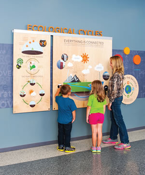
Graphic Signs. Signs with experiential graphics can be designed to express themes like sustainability, or murals that include depictions of current student achievers. Other themes may be science, health and wellness, the entire cycle of plant growth, soil mechanics, gardening and food and seed cycle. Combining architectural and themed graphic designs can add another dimension to school buildings.
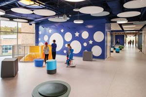
Most recently, VMDO has gone this route at its Buckingham Primary & Elementary School in Virginia, which has graphics primarily themed to health and wellness; and in another new school building, Discovery Elementary School, also in Virginia, a sustainability, nature and science theme called “Your Expanding World.”
At Buckingham, which opened its doors in 2012, some colorful graphics depict the entire cycle of plant growth, soil mechanics, gardening and food and seed cycle: all part of a positive process of education to help combat the national problem of childhood obesity, says Butler.
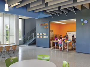
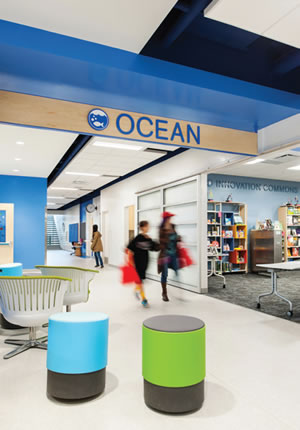
At Discovery, a net-zero energy consumption school completed and opened in fall 2015, VMDO uses graphics and signs to give curriculum-related names to building sections and rooms — a clear scheme that has fostered related lingo at the school. For example, the Pelican room in the Ocean hall, so instead of saying a room number, a child might say, ‘I’m a pelican in the ocean,’” Butler explains.
Signs continue to provide essential things such as building identity, messaging, directions and wayfinding amid various changes. And by doing so, such signs, like themed graphics, help a school function while focusing on its primary mission: educating students.
Some ideas about graphics and signage systems today:
- Keep an open mind about off-the-shelf electronic message center systems, if they are good quality, they can be cost effective, says Max Aronow. Ask about parts availability and durability.
- Expect a three- to five-year warranty for electronic signage systems, Rick Crawford recommends. And make sure that its software to easy to use.
- Sample some EMCs and try out their software before making a decision, Aronow adds.
- Ask about anti-graffiti features and options, such as clear coats on sign surfaces, Crawford says.
- Work with designers to create experiential graphics that engage students, says Butler. It’s not just about telling students that the messages are important, it’s also about showing students how they can make a difference.
This article originally appeared in the issue of .