Designing Today's Academic Libraries
PHOTOS COURTESY OF SASAKI ASSOCIATES
While academic libraries have been
undergoing renovations at a rapid pace through the
last 15 years (80 percent of 400 academic librarians
responding to a recent survey [see sidebar on page 15] indicated
experiencing a renovation since 2000), 39 percent of librarians indicate
that renovations are hindering their ability to do their jobs.
Perhaps this is because they were only consulted about the renovations
20 to 30 percent of the time, leading to a variety of design and
layout issues that make it difficult for patrons to access librarians
and for librarians to fulfill their day-to-day responsibilities.
“The purpose of this survey was to facilitate a productive and
proactive discussion on the physical landscape of academic librarians’
workspaces,” says Bryan Irwin, AIA, LEED-AP, principal of Watertown,
MA-based Sasaki Associates, the architectural firm that conducted the
survey. “Architects are being incredibly innovative in library collection
and study areas, yet one of the most critical components — the librarians
— remain captive to outdated design thinking.”
PHOTOS COURTESY OF SASAKI ASSOCIATES
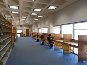
LET’S OPEN THIS UP. Today’s academic library designs
are shifting from yesterday’s miles of metal shelving and
rigid, isolating study cubicles (above) to open areas with
moveable furniture to facilitate collaboration.
While building owners and architects catch up on asking librarians what they need in their workspaces,
additional changes are taking place
in terms of academic library design as the
library’s raison d’etre has shifted in recent
years. “Today’s academic library is about
information and engagement,” observes
Irwin, “so the space is focused on bringing
everyone together. For as much as
the library has evolved, it has returned to
embracing engagement and dialogue. To
that end, a lot of universities are bringing
into the library new neighbors who didn’t
used to be there, such as math emporiums,
writing centers and tutoring centers to
create an end-user engagement with the
library serving as home base.”
In addition to services, changes are also
occurring in terms of color, light and design.
Color
Academic library color trends to neutral
in order to serve two purposes. One is to set a
tone conducive to studying and learning. The
second is to allow architectural details to take
the stage. John M. Olin Library on Washington
University’s Danforth campus in St. Louis is
a perfect example. Originally built in 1960,
the 202,616-square-foot facility is undergoing
a second, $18-million renovation to transfer
it into a center for 21st-century scholarship
by adding extra space for study, exploration,
technology and special collection storage. The
45,000-square-foot renovation project is being led by Boston-based Ann Beha Architects
(ABA), with St. Louis-based V Three Studios
serving as the local associate architect.
PHOTOS COURTESY OF SASAKI ASSOCIATES
“Use of color in this project is based on the
old and the new,” explains Leif Hauser, RA,
NCARB, LEED-AP, an architect with
V Three Studios. “Some original finishes,
such as terrazzo flooring in the grand stair,
hint at the appearance of the library from
when it first opened. In addition, the previous
renovation made extensive use of reddish
stained cherry wood millwork, white painted
wall surfaces and blue carpeting. While the
existing finishes are thoughtfully composed,
there has been a conscious decision to
somewhat deviate from while still harmonizing
with the legacy conditions. This includes
a neutral base for the palette rooted in grays
with flourishes of warm tones for accents.
The focus is placed on architectural form and
detailing, as well as exhibits and displays. The
net effect will be a light, bright appearance.”
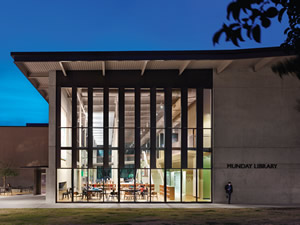
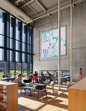
Similarly, Munday Library at St.
Edwards University in Austin, TX, which
recently underwent a renovation and
addition, has a subdued palette of muted
gray-green, burnt umber and yellow
ochre, allowing architectural details such
as tall, thin columns and exposed ductwork
to stand out. “These are the colors
of the Texas Hill Country the building
sits within,” observes Irwin, whose firm
designed the 2013 project.
Light
Both natural and artificial light are critical
to library design to ensure that all areas
may be successfully used for formal and informal
learning, understanding that different
areas within a library require different kinds
and levels of light. For example, reading areas
that receive no natural daylight may require
both overhead and task lighting, whereas a
café with natural daylight may only require
additional lighting for ambiance.
“Light remains a tricky design issue
because obviously there’s a push with
sustainable design to use as much daylight
as possible to minimize artificial light
consumption,” notes Hauser, “yet we have
to balance that with adequate light levels for
reading fine print through a sustained period
of time.” John M. Olin Library balances
necessary artificial lighting for below-grade
levels with ample natural daylighting at the
perimeter from expanses of exterior glazing.
PHOTOS COURTESY OF SASAKI ASSOCIATES
Munday Library also boasts natural
daylight, so much so that the interior is
aglow with natural light throughout the
day, requiring only minor supplemental
artificial light. “The design team calibrated
the amount of natural light that enters
the building throughout the various times
of the day and year,” says Irwin. “Metal
fins were applied to the east and west
exterior curtainwalls, angled and spaced
in such a manner as to allow morning and
afternoon sunlight to bounce deep into
the building’s core. Additionally, a scrim
is stretched below the main skylight that
serves to diffuse the harsh mid-day sun
entering from above. Finally, a large expanse
of uninterrupted glass on the north
side of the building — where no direct sun enters — allows in the soft northern
light and affords a dramatic view of the
Austin skyline.”
Design
“When it comes to design,” says Hauser,
“historically, there was a high level of focus
on controlling access to the library: one
way in and one way out, which protected
the physical collection from leaving the
library. Now, however, there’s less reliance
on the physical collection and greater
reliance on digital sources. As a result,
library administrators want to break down
barriers and allow students to freely enter
and freely circulate the library. They’re
shifting their focus from protecting absolutely
every last article in the collection to
allocating resources to protect irreplaceable
special collections. That has design
implications in terms of creating main streets in libraries where students are free
to use the space as an extension of exterior
campus circulation paths.”
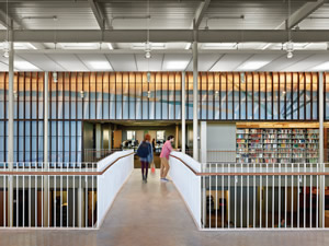
PHOTOS COURTESY OF SASAKI ASSOCIATES
WE’RE HERE FOR YOU. A major issue facing academic and research libraries — and librarians — today is what should
their role be in the changing academic and technological landscape. An important aspect of academic libraries, however,
is to design for the mission of the library, not the personalities of the library staff. The design must both allow for and
facilitate interaction between library patrons and staff, while at the same time accommodating technology and remaining
flexible in the changing teaching and learning landscape.
When complete in 2017, Olin library will
feature such a design via a major pedestrian
circulation path through the building.
“Instead of having a singular control point
closely guarding access to the entirety of
the library’s holdings,” Hauser describes,
“the campus community is invited to freely
pass through the library.”
Irwin similarly notes that he sees library
design as an opportunity to promote
community: “Stairwells and circulation
paths are celebrated as design features
because they help emphasize a sense of
movement and engagement and they support
the spontaneous meetings that occur
on stairwells and in corridors. So there’s a
lot more focus on those elements.
“You still need to offer students and
faculty the opportunity for individual contemplative
thought,” Irwin continues. “I
believe that learning is about toggling back
and forth between individual contemplative
thought and engagement to test ideas.
It raises the question: How can design support
both ends of the spectrum?”
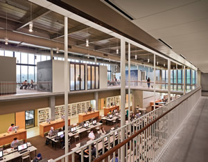
At almost 47,000 square feet, Munday
Library presents as a central space
that enhances and catalyzes interaction
around technology and group learning.
Student interactions, research and inquiry
all happen within sight of one another and
are supported by a variety of study spaces.
The central location of the commons,
where all student services are organized,
makes it a catalyst for programs and
initiatives. A bridge on the second floor
(home of the general collection and the
Writing and Media Center) visually connects
the two floors.
As the academic library settles into
a new balance of physical and electronic
collections, quiet study and social gathering
spaces, hopefully architects and
building owners will include librarians
in the design process so that the facilities
also enable them to effectively serve their
patrons.
ABOUT THE SURVEY
Sasaki’s library survey uncovered a lot
of information about why many academic
library renovations miss the mark. For
example, when renovations are made,
librarians are often on the end of receiving
changes they considered low priority:
they saw cafés introduced 11 percent of
the time, when they prioritize this change
just three percent of the time. Meanwhile,
shelving was removed 18 percent of the
time when only one percent of librarians
said the removal was important. These
changes have major impacts on librarians,
forcing them to try to fit their roles into
the physical spaces that exist.
Another example is librarian access to
patrons. Currently, regardless of workspace
type, 59 percent of librarians stated that
their workspace is hidden from the public
eye, making it difficult for patrons to know
where they can get help and forcing them
to rely on technology-aided access. Further
compounding the problem, 25 percent of
librarians stated that, through organizational
restructuring, their access to patrons
has further decreased.
To read the survey, visit librarysurvey.sasaki.com.
This article originally appeared in the issue of .