Looking Back, Moving Forward
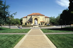
PHOTO COURTESY STANFORD UNIVERSITY, SPECIAL COLLECTIONS AND UNIVERSITY ARCHIVES
Building on historic campuses can be a conundrum. There’s so much history to protect and
preserve, yet contemporary buildings should be just
that: contemporary. Three architects talk about the challenges and
rewards of building on historic campuses.
Stanford University
Frederick Law Olmsted, along with architectural firm Shepley,
Rutan and Coolidge, designed Stanford University’s California
Mission-inspired campus in the late 1880s. The campus has many
buildings made of local sandstone and red-tiled roofs, but, “even
our historic buildings have different styles,” admits Stanford
University Architect David Lenox.
Preservation is most important when maintaining structures on
Stanford’s Quad. But Lenox references four points when planning
a new building on campus: Does it adhere to Olmstead’s original
master plan? Does it connect to the landscape in a respectful way? Is
the scale appropriate for pedestrian traffic? And, most importantly,
Is the material palette cohesive with the rest of the campus?
To that end, the school highly encourages architects to use
a specific, buff-colored limestone, along with deep bronze and
“Stanford Black,” but doesn’t insist on it. “We are not slaves to the
materials but we do want to make sure things fit,” explains Lenox.
They are also not afraid to add some completely modern elements.
Look to Stanford’s famous d.school for a case in point. The
structure was built in four phases with one sandstone wing, two stucco wings and “a bad infill center,” according
to Lenox. The infill was replaced
with a contemporary box that features
curtain walls to expose and celebrate the
older materials. “It was a way to update the
building, keep the defining characteristics
and infuse modern qualities.”
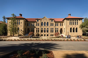
PHOTO © LINDA A. CICERO/STANFORD NEWS SERVICE
THIS ONE’S A KEEPER. The National Register of Historic Places recommends that when deteriorated, damaged or lost
features of a historic building need repair or replacement, it is almost always best to use historic materials. For a college or
university, care must be taken to do so while finding the balance between preserving a historic facility and also updating it
with today’s energy and sustainability standards as well as contemporary aesthetics.
The Old Chem building, one of the original
Stanford Noble buildings, offers another
example. The structure sat idle, mothballed
after an earthquake toppled its 39 chimneys.
Stanford could have replaced it, but
a large donation allowed a renovation that
blends the classic architecture with modern
elements. After gutting the building, the
school interwove classic, defining elements
like wood wainscoting and wrought-iron
railings with modern interventions like a
curved glass lobby. “It’s a powerful reminder
of our history but will still work for the
students of tomorrow,” says Lenox.
Duke University
Say Duke University, and you instantly think of the late 1920s
Collegiate Gothic Quad, designed by Horace Trumbauer, Julian F.
Abele and the Olmstead Brothers. The Durham, NC-based school
has grown quite a bit since then, radiating out from the historic
quad, but never forgets its core. When working on a new structure,
Greg Warwick, AIA, coordinating architect, Duke University, looks
for “unity but not uniformity,” in the design.
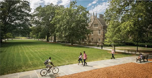
PHOTO © CHRIS HILDRETH/DUKE PHOTOGRAPHY
Location matters when choosing building materials. New structures
on or near the historic quad must use “Duke Stone” on their
façades to achieve that unity. However, the architect is free to explore
other modern yet appropriate materials for the building’s sides and
back. ZGF Architects LLP did just that when designing the Center for
Interdisciplinary Engineering, Medicine and Applied Sciences in 2004.
Forms and structures get more contemporary as they move away
from the central quad. “We don’t want to be seen as stuck in 1930,”
explains Warwick. Yet he does not advocate modernity just for the
sake of it. “There may not be much contextual inhibition a half mile
from the quad, but it still has to look like a Duke building,” he says.
Warwick remains a staunch advocate for variety but he doesn’t want
something, “so unique that you don’t know where you are.”
Warwick is not a fan of using traditional materials in untraditional
ways. He points to several projects from the 1960s to the
1980s that experimented with Duke Stone — using it in a large
panel or turning it on its side — and calls them unsuccessful. “It
just doesn’t look right,” he says. In fact, the demand for classically
used Duke Stone remains so strong that a cottage industry of
expert masons has sprung up in the surrounding region.
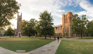
PHOTO © CHRIS HILDRETH/DUKE PHOTOGRAPHY
Warwick spends much if his time maintaining, repairing and
restoring historic buildings. Admittedly, it’s a challenge. “I walked
around campus all summer looking at doors, trying to pick the
right stain. They’re all different,” he laments. Warwick is also challenged
by the many steel windows on the quad. Not well insulated
and sustainability-challenged, the windows nevertheless persist.
“They would never be replaced,” Warwick insists. “We repair them
and put more insulation elsewhere.”
College of Charleston
When first considering the design of the Marlene and Nathan
Addlestone Library, College of Charleston President Alex “Judge”
Sanders had a very specific vision in mind. After all, the South Carolina-based school, founded in the 1770s, drips with history. There
are venerable rows of live oak trees draped with Spanish moss and
several buildings with National Historic Landmark designations. Dr.
Sanders wanted the library to mirror one of those structures. “He
said ‘I want the library to look exactly like Randolph Hall,’” recalls
William McCuen, director of design, KAI Design & Build.
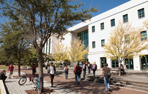
PHOTO COURTESY OF THE COLLEGE OF CHARLESTON
Of course, constructing a three-story, 140,000-square-foot,
contemporary library to look like one of the oldest college buildings
still in use in the U.S. just was not financially feasible or aesthetically
correct. Winning over the college president and the many, many impassioned
stakeholders proved a challenge. “The City of Charleston
is the most controlled environment I’ve ever seen and I was on the
National Capital Planning Commission,” McCuen insists.
McCuen eventually convinced the community that a poor-quality
counterfeit would insult rather than complement the city’s
rich history. He still drew from local inspiration, however — in
this case the similarly massed Fort Sumter and Fort Moultrie —
and used a stucco that looks similar to the rough-textured Tabby
concrete used throughout the city.
Today the library is both a success story and a trailblazer. Since
opening in 2005, the building has been joined by other contemporary
structures, including the Beatty Center School of Business
and the 26,000-square-foot dining hall named the Liberty Street
Fresh Food Company.
This article originally appeared in the issue of .