The WOW! Factor

PHOTOS © HEWITT/ GARRISON ARCHITECTURAL PHOTOGRAPHY
The newest concept in residential dining at the University of California (UC), San Diego campus, 64 Degrees (64°), draws on the long history of Revelle College and its namesake, oceanographer Roger Revelle. Revelle College was the first college founded at UC San Diego and was named after Revelle in 1964.
Located at the heart of student residences in Revelle College and constructed at a cost of $12.1 million, the reimagined facility, designed by Studio E Architects of San Diego, is a complete renovation of the 1966 Revelle Dining Commons, the original dining destination on campus. The restaurant was named 64 Degrees in reference to the average temperature in La Jolla (64°), the founding year of Revelle College (1964) and the height of Roger Revelle (6’4”).
The UC San Diego’s department of Housing Dining Hospitality (HDH) had goals to provide a dining experience that was interactive and put the act of cooking and the natural beauty of food on display. HDH employs more than 1,100 career and student employees; houses over 15,000 students, staff, faculty and their families; encompasses over 5,000,000 square feet on campus; serves meals to 4,000,000 customers each year; and operates on an annual budget in excess of $100 million.

PHOTOS © HEWITT/ GARRISON ARCHITECTURAL PHOTOGRAPHY
The team recognized that to signify to the student population that a complete transformation of the facility had occurred, a design with a high “WOW! factor” was needed. Accepting the challenge, Studio E Architects took the extremely dated “cafeteria” style facility and transformed it into a vibrant place like no other on this campus, or any other. In collaboration with Webb Food Service Design, the design team focused on UC San Diego’s desire for an innovative food concept destination and the creation of a place that the Revelle College community would embrace as a hub for congregating and socializing.
Joining Spaces
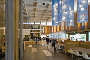
One of the challenges of the existing building was connecting disparate spaces with different volumes into one dining environment. The design team sought to put people where they most desire to be — near natural light and near the action. The former dining room, known as the “Big Box,” had light and volume (24-foot-tall ceiling) in abundance, but always felt empty. The solution was to fill the large volume with activity and with appropriately scaled design elements that both filled and organized the space. These elements were:
- Groups of large-scale, custom translucent resin light pendants suspended over seating groups.
- Metal-coil curtain drapery panels in tones of matte silver and gold used to both screen and define areas.
- A large-scale double-sided fireplace wall and hearth.
- Vertical booth divider panels of laser-cut translucent resin that provide intimacy to occupants while giving the booths more presence within the large space.
- A 3-in-1 food station as a focal point.
These elements were arranged in combination with seating elements and furniture to create intimate neighborhoods within the larger space, where students would feel comfortable both eating and hanging out to socialize and study.

PHOTOS © HEWITT/ GARRISON ARCHITECTURAL PHOTOGRAPHY
The Theater of Cooking
To address UC San Diego’s desire to put the theater of cooking front and center, the design team located a large food station as a focal point within the Big Box and relocated the main entry into this volume, creating a memorable first impression upon entering the space. This is the first of four food stations within the facility and combines a deli, salad bar and wok station in addition to counter seating for guests to get close to the cooking action.
An original mural by artist Howard Warshaw was maintained as a backdrop within the Big Box. The mural set the tone for the color palette, which brought in natural hues of earth and ocean. New pops of color were injected into the Big Box in the illuminated, translucent resin linear panels inserted at random around the perimeter of the space.
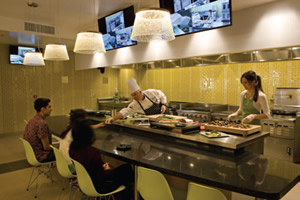
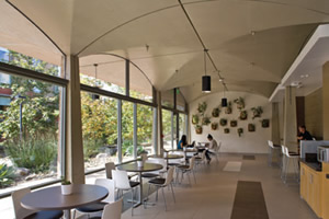
In order to create a flow and sense of openness between the Big Box and other, lower portions of the building, dividing walls were removed and skylights were inserted to bring in natural light. The lower space has a ceiling plane that accents unique floating light fixtures and a focal point in the Demonstration Station, where HDH chefs can display their skills and interact with the guests. Audiovisual technology is integrated into this station to display cooking demonstrations on screens throughout the facility.
Similar materials are used to tie the spaces together — porcelain floor tile with a large scale random accent pattern, glossy white large-format tile with glass tile accents at the food stations, warm wood-grain panels and metal-coil curtain dividers.
Seamless Transitions
In addition to the dining component, the program also included a café/ market within the building and the renovation of two adjacent exterior courtyards to the north and south of the building. The new design creates a seamless transition between the exterior and interior spaces. The location of the café/ market (with its longer hours of operation) in a highly visible location overlooking the south courtyard ensures activity at all hours and provides a lively approach to the facility.
The facility seats 288 in the main dining area and 35 in the café/market. The exterior spaces were designed to accommodate seating of 190, with concrete seat walls providing additional seating. A variety of seating options are mixed among the food platforms, ranging from large six-person booths to counter seating at windows overlooking the courtyard to counter-height community tables to soft seating around the fireplaces. A typical four-top table is not to be found.

PHOTOS © HEWITT/ GARRISON ARCHITECTURAL PHOTOGRAPHY
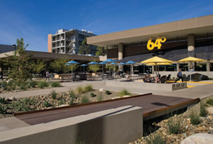
Bold, oversized exterior signage (including a 56-foot-wide-by-22-foot-high illuminated graphic of a surfer catching a wave) draws customers from the surrounding residences, parking lots and main campus circulation spaces. The south courtyard combines different textures and materials in a playful design, including a “beach blanket” of striped rubber surfacing with oversized umbrellas and Adirondack chairs for lounging. A bosque of Palo Verde trees will provide a canopy under which students dine at custom-designed wood and steel community tables. In keeping with Revelle College’s sustainability mission, the courtyard was designed to allow for maximum infiltration of storm water through porous concrete paving and planted bioswales.
An ipe wood bridge element over a bioswale marks the symbolic entry into the courtyard and accentuates the main circulation through it. Work to the exterior of the existing building was limited to storefront glazing upgrades to enhance energy efficiency and an 80-foot-long metal lath twisted awning to provide shading along the south-facing windows and accentuate the main entry.
A New Life
In addition to creating a new, modern vibe for an aging facility, the design team addressed significant building infrastructure upgrades, such as complete replacement of the HVAC system, fire and life safety upgrades, a seismic retrofit and completely new food service equipment and associated MPE changes. Sustainable objectives of the campus were addressed in the specification of highly energy-efficient mechanical equipment and controls systems and LED lighting systems.
This project was completed within an aggressive six-month construction schedule to open to students at the start of Fall 2014 semester. The project renovated approximately 27,000 square feet of the 33,500-square-foot, one-story building, including infrastructure work in the 4,000-square-foot mechanical basement and approximately 30,000 square feet of site work.
The result of this renovation is “an innovative campus destination for foodies,” according to 64 Degrees’ Pinterest page (www.pinterest.com/ucsdhdh/64-degrees). One with the WOW! factor for the UC San Diego community.
This article originally appeared in the issue of .