The Gathering Spot
RENDERING © PERKINS+WILL
Student, university and campus centers are flagship structures in coveted locations. The centers’ many functions are crucial, with implications for student life, town and gown relationships, alumni and donors. Accordingly, their exteriors make important impressions.
Student centers, for example, now “represent one of the few campus environments that belong to the entire campus community — not a specific college or dean,” architect Jeff Stebar of Perkins+Will tells College Planning & Management, “They truly are the ‘family room’ of campus.”
That room, so to speak, starts and ends at the exterior, with elements such as furnishings, bollards, fencing and masonry gates helping to define circulation and security as well as ideas of place in bustling, high-profile campus locales. Moving to the buildings themselves, façades start that process of defining ideas. In fact, as Stebar says, “façades become critically important to projecting a welcoming, inviting and vibrant beacon of student life; at the same time blending with the surrounding existing architectural context.”
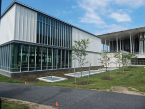
PHOTO © SCOTT BERMAN
A GROWING CONCERN. While the University at Albany SUNY Campus Center was designed for a university of 10,000 students, enrollment has grown to more than 17,000 undergraduates and graduate students. Today, the expanded Campus Center remains the hub of student activity, providing many more dining options and nearly 9,000 meals per day.
How do some current and recent projects on the exteriors of such buildings speak to those buildings’ prime importance? There are perhaps as many ways as there are centers, owing to the unique conditions and goals that can be found on any campus. The façades, outdoor lighting and furnishings, and broader contexts of three such projects — at University at Albany SUNY, the University of Kentucky, and Sheridan College in Wyoming — offer recent, interesting and varied examples.
New York State of Mind
A recent visit to Albany’s Uptown Campus revealed significant changes to the Campus Center, including a 22,000-square-foot east addition, housing a high-ceiling dining hall, which opened in 2016. Currently underway: a 55,000-square-foot west expansion that will house auditorium, rehearsal, resource and student spaces. The spaces are part of a larger, $60 million renovation and expansion project that architect William Rawn Associates says “re-establishes the prominence” of the center of campus characterized by its 1960s Modernist design by Edward Durell Stone.
RENDERING © PERKINS+WILL
The exteriors of the new additions clearly reference the enormous original, extending Stone’s building without trying to replicate his ideas from decades ago. The façades of each sleek new addition have narrow vertical forms on masonry and window systems, an array that abstractly references the original building’s own exterior glass and particularly its long, multiple rows of slender columns that support a great overhanging roof. The masonry matches the light-hued tone of the original and is divided by an uninterrupted horizontal, which meets the height of the original building’s podium. The overall impression: an expanded campus center with an exterior that, with new functions and amenities, refreshes the campus hub.
Updating a Bluegrass Tradition
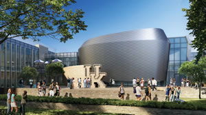
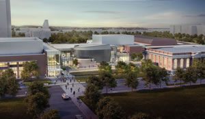
The exterior systems of another extensive project use campus tradition as a point of leverage to express future goals: the $200 million, 365,000-square-foot renovation and addition project underway at the University of Kentucky Student Center in Lexington. Slated for completion in January 2018, the project has an exterior “intentionally designed to represent both the rich legacy of the university and its aspirational vision of the future,” says Perkins+Wills’ Stebar.
He says the architects sought an exterior that “could span the design spectrum from ‘tradition to trend’; and then, to simultaneously create a bright, daylight-filled, sustainable building that would welcome today’s and tomorrow’s students — all while effortlessly blending with the campus’ architectural context.”
RENDERING © PERKINS+WILL
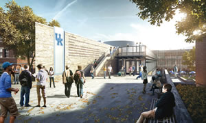
The façade does so through balance, between masonry that combines limestone and new and legacy brick kept from two old campus buildings, including some brick façade from the university’s original 79-year-old student union. These appear with contemporary forms “clad in glass curtain wall and zinc panels,” Stebar explains.
This exterior has considerable drama: the glass curtain wall appears in great expanses, and at one focal point, panels cover the drum-like form of an auditorium space — another great drum appears elsewhere, seemingly submerged into the building behind curtain glass — positioned behind a curving masonry wall that culminates in enormous UK letters. Renderings envision clusters of steel outdoor furniture under umbrellas, positioned at key thoroughfare and gathering points.
Forever West
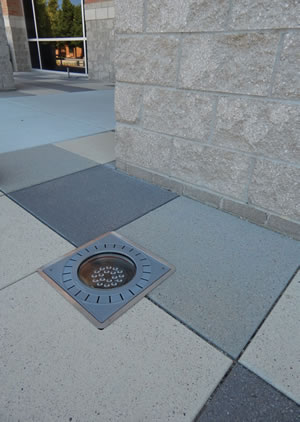
PHOTO © SCOTT BERMAN
YOU ARE WELCOME HERE. The expanded role of today’s student center sees these facilities incorporating a variety of different functions and activities. Visual appeal is important; it invites people to approach, visit and engage in the spaces offered, both inside and outside. Inviting, attractive, functional and open are crucial design elements for these facilities.
The recently renovated and expanded Sheridan College Thorne-Rider Campus Center in northern Wyoming is on a very different scale in a very different location. Yet, the project, which almost doubled the size of the existing center, is also having a major impact on its campus.
In this case by working in concert with other projects at Sheridan to rejuvenate the center of the campus and its pedestrian mall, explains Facilities Director Kent Anderson.
Thorne-Rider is built into grade, with sections on two levels — the new, lower one flows out onto the pedestrian mall. Outdoor seating areas on two sides feature Wabash Valley Urbanscape metal chairs upon Dayton Tectura plaza tiles in three colors, explain Karen Kelly of Arete Design Group and Dayton Rush of CTA Architects.
CTA’s Joel Anderson points out the robust elements of the façade’s features, which withstand the temperature swings of the region’s climate while reflecting the campus aesthetic. Brick matches the tones of others on campus, with a base of rock-face finish anchor block and polished, ground-finished block. The cornice above is a glass fiber reinforced concrete, and there is floor-to-ceiling glass curtain wall.
LED outdoor lighting casts programmable, multi-color light against the façade, illuminating the masonry with colors based on occasions at hand: school colors during orientation, or red and green during the holiday season, for example. It’s all part of an exterior of a revitalized building that the facilities director says has “changed the culture of our campus.”
The right façade and exterior glass systems, lighting, furnishings, paving systems and more can be marshaled at student, university and campus centers toward broader ideas. As Stebar adds of student centers: they are “critical to creating a vital campus community and have an important role in recruiting future students and retaining current students.”
THREE IDEAS ABOUT THE EXTERIORS OF CAMPUS CENTERS:
- Step outside the box to express the legacy and the future of an institution.
- “Do not automatically dismiss new systems only because they have not been previously used on their campus,” says Perkins+Wills’ Stebar.
- Think about lighting, furnishings and paving that will animate the exterior of a center.
This article originally appeared in the issue of .