Designing with an Eye to the Future
An inside look at two schools in Copenhagen that feature transparency and flexibility.
Extensive use of daylighting,
overall energy efficiency,
transparency, flexibility and high-end
performing arts facilities, to name a
few, are all present in the interior spaces of
many public and private school buildings
in the United States. These are among the
features that signal meritorious responses
to changing educational times.
That being said, it is useful to consider
educational interiors elsewhere, such as in
Scandinavia, which has long been noted for
its design acumen.
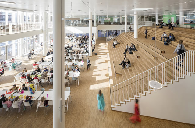
ARCHITECT: C.F. MØLLER ARCHITECTS; PHOTOGRAPHER: ADAM MØRK
A telling example is the Copenhagen
International School (CIS) in Copenhagen,
Denmark which opened in 2017. Designed
by C.F. Møller, the school has won several
architectural design awards in Europe.
Its 1,000 students are the children of
international executives and diplomats
stationed in the Danish capital, in addition
to youngsters with scholarships.
As the architectural firm puts it, “the
main school building is subdivided into
four ‘towers’, ranging from five to seven
stories, each specially adapted to meet
the needs of children at different stages of
development.” For example, the youngest
pupils’ classrooms are large to hold
and enable many activities, C.F. Møller
explained. Furthermore, those youngsters’
classrooms open directly onto a rooftop
playground.
The four towers, which form the
“subdivision of the school [which]
facilitates community, identity and easy
wayfinding,” sit atop a ground-floor base
that holds common areas.
A School Like a Town
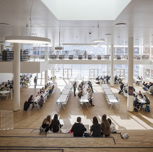
ARCHITECT: C.F. MØLLER ARCHITECTS; PHOTOGRAPHER: ADAM MØRK
“It’s modeled in a way [like] your
typical town,” Thomas Nielsen, the
school’s director of Communications and
Advancement, said of the design of the
building. For example, the main entrance,
through a vestibule, leads to an ample
foyer overlooking the school’s large central
communal space. Like a town square,
the expansive space is a hub for social
interaction. A level below the foyer, it
features the cafeteria dining room, which is also overlooked by the library and a grand
learning staircase. The ample exterior glass
at the base whimsically conjures the notion
of the “town” being lifted up a floor, with
sunlight pouring in underneath.
The design of the central interior space
was the result of tradeoffs, made after some
debate, Nielsen indicated. For example, the
open library overlooking the dining area
was placed front and center as opposed
to being cloistered away deep within the
school. Library programs are coordinated
to avoid noisy lunch periods. Planners
considered glassing in the entire space
(study rooms are glassed in) to cut noise,
but chose instead to leave the library open
and accessible and an integral part of the
center space and the life of the school.
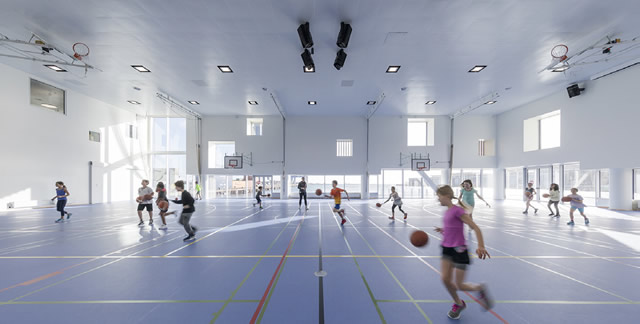
ARCHITECT: C.F. MØLLER ARCHITECTS; PHOTOGRAPHER: ADAM MØRK
Gym Daze. The hub is at the core of the school’s first two floors, which hold common facilities such
as three gymnasiums, a fitness center, a dance studio and a performing arts facility.
The hub is at the core of the school’s
first two floors, which hold common
facilities such as three gymnasiums,
a fitness center, a dance studio and
a performing arts facility, featuring
a 300-seat theatre. The theatre, with
professional grade lighting and sound
systems, is not only used for school
productions — the school’s International
Baccalaureate curriculum is strong in
theatre arts — but also, occasionally,
by production companies, which in turn
offer master classes to students, Nielsen
explained. The theatre also has other
functions: At first glance, its seats seem
immovable, but are in fact accordion,
opening up space for exam sessions;
a second use that is apropos given the
theatre’s soundproofing.
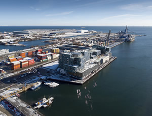
ARCHITECT: C.F. MØLLER ARCHITECTS; PHOTOGRAPHER: ADAM MØRK
On Deck. The main school building is subdivided
into four towers, ranging from five to
seven stories, each specifically adapted to meet
the needs of children at different stages of
development.
The school has a rooftop garden
and event space with student-designed
furnishings — some are constructed from
repurposed wooden pallets. There is also
a greenhouse tended by middle schoolers;
sections of green roof; adjustable LED
lighting with bright, sunlight-like settings
that acknowledge Scandinavia’s long, dark
winters; interactive smart boards instead
of projectors; and locker banks that are
small and mobile with wheels.
A Public School Example
Another illustrative example is taking shape elsewhere
in the Danish capital. Møller, worked with another
firm, Tredje Natur, to deliver a different and distinctive
educational design — this time for a public school, New
Islands Brygge School in Copenhagen’s Amager section.
The middle school, now being developed, will feature
a double-height dining room beneath oculus-like ceiling
openings, adding daylight. Another dramatic feature — a
grand exterior “activity staircase” — starts at street level
and leads to the school’s rooftop terrace which doubles as an
outdoor learning and physical education space. The staircase
itself serves as a teaching and learning space and can be used as
an amphitheater for outdoor events. Additionally, climbing the
stairs will provide physical activity for students at the school,
where healthy eating and physical activity are a key focus.
ARCHITECT: C.F. MØLLER ARCHITECTS; PHOTOGRAPHER: ADAM MØRK
Expressions of Transparency
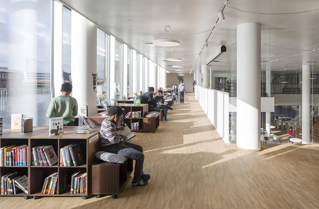
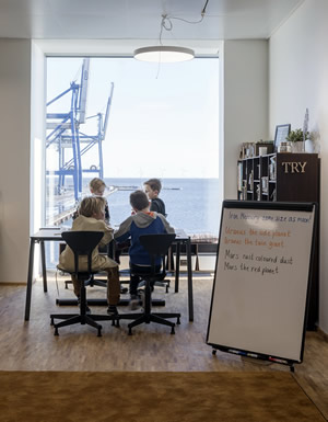
Back at CIS, transparency is expressed in various
ways throughout the building. There are ample expanses
of exterior glass, which enables views inside and out of
common spaces and classrooms; open areas, such as the
library; interior practice rooms called music pods with large
windows facing corridors; and the corridors themselves are
wide enough to enable transit and contain open areas for
pausing, study and supervision. Transparency is also evident
in other ways, such as interior glass walls of classrooms at
the perimeter, bringing daylight deep within the building
and views of the outdoors. The corridors that run the length
of the building provide lines of sight to perimeter glass at
both ends, thus enhancing the ability to be visibly-oriented
to the outdoors from within the building.
ARCHITECT: C.F. MØLLER ARCHITECTS; PHOTOGRAPHER: ADAM MØRK
A final expression of transparency found at the school
looks to the future. Beams and members of the steel-frame
construction are revealed at various points, thus the structure
of the building itself is made more apparent for young people
who may be, or become, interested in engineering and
architecture. And with the revealed steel-frame construction
come the possibility for future options: by having fewer load-bearing
walls, changes to the interior — such as combining
rooms or otherwise changing the configuration of spaces —
will be easier in years and decades to come.
In doing so, the interior meets today’s needs and
acknowledges that its spaces may have to change to meet
future needs. As Nielsen adds of that possibility, “We know
what we want now, but 10, 15, or 50 years from now, who
knows?”
This article originally appeared in the School Planning & Management October 2019 issue of Spaces4Learning.